Category: International

  • Andy Warhol “Queen Elizabeth II of the United Kingdom” from “Reigning Queens”, 1985 – Spring Live Auction of Important Canadian & International Art (June 8th)

    American artist Andy Warhol once declared “I want to be as famous as the Queen of England”. A leading figure of the Pop Art movement of the 1950s and 60s, Warhol was famous for appropriating familiar images from consumer culture and mass media, including many silkscreen prints of public figures. Determined to become a celebrity himself, he made art out of what people desired most: money, power and fame. Some of his early subjects in the 1960s were photographs of Marilyn Monroe, Elvis Presley, and Elizabeth Taylor. By the following decade, he had garnered sufficient success and recognition that he began to receive portrait commissions from living celebrities including the Shah of Iran, Mohammad Reza Pahlavi, as well as his wife and sister, Mick Jagger, Liza Minnelli, John Lennon, Diana Ross, and Brigitte Bardot. People were eager to be immortalized in Warhol’s signature silkscreen techniques and fluorescent colour schemes.

    Andy Warhol Queen Elizabeth II of the United Kingdom, from Reigning Queens, 1985

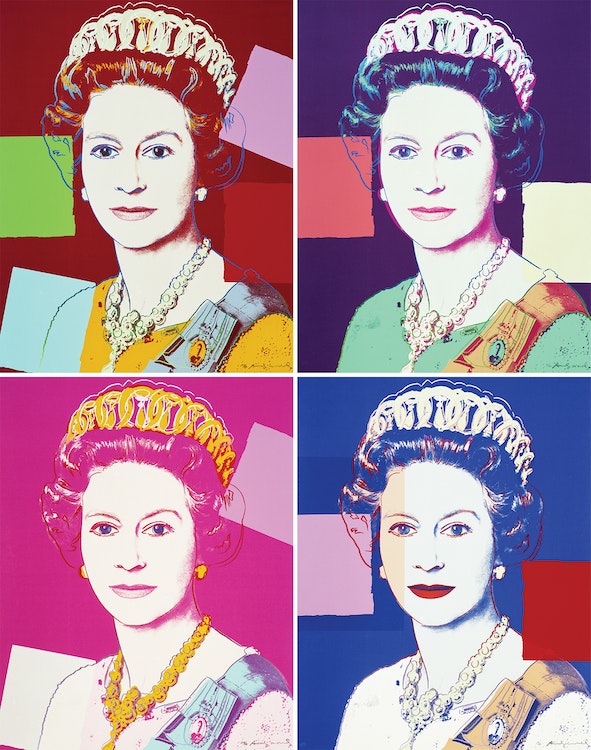
    However, there were some public figures who remained out of reach for Warhol. One was Queen Elizabeth II, who was widely considered the most recognizable person in the world. Warhol was eager to make a portrait of her, and in 1982 his European dealer George Mulder wrote a letter to the monarch’s private secretary, Sir William Heseltine. Mulder requested permission for Warhol to create a set of four silkscreen prints using the Queen’s official portrait from the Silver Jubilee in 1977, a photograph taken by Peter Grugeon at Windsor Castle on April 2, 1975. Heseltine replied with an ambiguous, but ultimately favourable response, writing, “While The Queen would certainly not wish to put any obstacles in Mr. Warhol’s way, she would not dream of offering any comment on this idea.”

    Delighted, Warhol set to work on his largest and most ambitious portfolio of silkscreens. The result was the Reigning Queens series featuring four prints each of Queen Elizabeth II of the United Kingdom, Queen Beatrix of the Netherlands, Queen Ntombi Twala of Swaziland and Queen Margrethe II of Denmark. These four female monarchs were all ruling in the world at the time of the portfolio’s publication in 1985, and each of them had assumed the throne by birthright, rather than through marriage. Warhol, who was fascinated by universal images, based these silkscreens on the queens’ official state portraits, as these photographs were often mass-produced on currency and stamps. Warhol presents Queen Elizabeth II as an iconic and glamorous figure. “Time Magazine” wrote that Warhol’s portraits of Queen Elizabeth II “treat her like any other celebrity, frozen in time and bright colours”. The repetition of the four prints is reminiscent of postage stamps, referencing the extent of the mass production of the Queen’s image. Warhol has treated the Queen not as a monarch, but as one of the many celebrities he depicted. His approach reinvigorated the traditional presentation of royalty.

    The same image of Queen Elizabeth II appears in all four prints but they vary in colour. Each features graphic colour blocks applied separately over the photographs. Warhol began working in this style in the mid-1970s, fragmenting the image with various overlaid shapes and areas of colour. He also added his own outlines, suggesting the stylized make-up of a Hollywood star, and associating the portrait with the cult of celebrity that was prevalent in the 1980s and in Warhol’s œuvre. By comparison to his earlier prints which had a deliberately impersonal, automated appearance, these decorations to the image gave the work a more ‘artistic’ look. With his typical ambivalent attitude, Warhol explained these modifications to his prints as extraneous: “I really would still rather do just a silkscreen of the face without all the rest, but people expect just a little bit more. That’s why I put in all the drawing.”

    “Queen Elizabeth II” was well-received by the Royal Collection of the British Royal Family, who wrote that “Warhol has simplified Grugeon’s portrait so that all that remains is a mask-like face. All character has been removed and we are confronted by a symbol of royal power”. George Mulder sent photographs of the prints to the Palace, possibly hoping the Queen might consider purchasing one. Heseltine replied to Mulder: “I am commanded by the Queen to acknowledge your letter of 11th March and to thank you for sending the photographs of the silkscreen prints by Andy Warhol which Her Majesty was most pleased and interested to see”. Later, in 2012, four prints from the Royal edition of “Queen Elizabeth II” were acquired by the British Royal Collection. These prints are the only portraits in the Royal Collection that Queen Elizabeth did not sit for or commission.

    The Reigning Queens series combines many of Warhol’s central themes – celebrity, portraiture, consumerism, decoration and social hierarchy.

    The four works comprising “Queen Elizabeth II” are printed in an edition of forty with ten artist proofs, five printer proofs and three hors commerce. The work is also published as a Royal Edition with diamond dust on the drawing lines, published in an edition of thirty with five artist proofs, two printer proofs and two hors commerce. These four silkscreen prints are highly coveted, particularly as a complete set, as they had a rejuvenating influence on the nature of portraiture and are some of Andy Warhol’s most celebrated work.

    This collection of four works is being sold to benefit the Winnipeg Art Gallery (WAG)-Qaumajuq in establishing an endowment fund to support more diverse representation in the permanent collection, beginning with contemporary Indigenous art. Cowley Abbott is proud to donate our selling commission to the fund as part of the sale.

  • Joan Mitchell “Untitled” – Spring Live Auction of Important Canadian & International Art (June 8th)

    Joan Mitchell was a prominent American artist closely associated with the Abstract Expressionist movement, the New York School, and international abstract painting of a gestural sort. She spent most of her professional life in France, first in Paris in the 1950s, and from 1967 in Vétheuil, Claude Monet’s home from 1878-1881. While in France she exhibited at the most acclaimed international venues for contemporary art, including 5th Bienal do Museo de Arte Moderna, São Paulo, Brazil (1959), Documenta II in Kassel, Germany (1959), and the 29th Venice Biennale (1958).

    Joan Mitchell Untitled

    Typical of Mitchell’s art in general, Untitled is both delicate and powerful. She frequently worked on paper, expressing gestures that seem larger in scale than they actually are, in part because the forms animate a fundamentally open space. Areas in the upper left and right of this surface are particularly intense thanks to the accumulation of dark green, red, and blue pigment. If these zones might seem to implode from their own weight, for balance, Mitchell simultaneously thins some of her colours and streaks them across the surface. The light blue and delicate green skeins of pooled colour under the two denser forms to the left and right respectively seem to soak into the surface. Yet Mitchell’s brushstroke is always evident, moving the colour around no matter how ephemeral it becomes. This effect is especially evident in the centre of the work and holds the more heavily worked dancing forms apart.

    The comparison of one artist with others in their immediate context or from a longer history is a hallmark of writing about art in museums, auction catalogues, and Art History. Mitchell is often discussed with reference to other women members of the AbEx circle‒Helen Frankenthaler or Lee Krasner, for example‒and especially with respect to her long-time life partner, the Canadian abstract painter Jean Paul Riopelle. Such comparisons can be enlightening, as many witnessed in the 2017-18 exhibition “Mitchell/Riopelle: Nothing in Moderation”, which systematically and extensively placed works by both abstractionists into visual conversation. Nonetheless, comparison invites the establishment of a hierarchy or of a false dichotomy, whether covertly or overtly displayed. It’s worth asking whether we should, in the face of Mitchell’s Untitled, default to comparisons at all.

    Is the alternative to perceive this painting on its own terms? Do we see it as highly dynamic, an intimation of a life force and testimony to abstract painting’s abilities, or is it perhaps received as agitated, an embodiment of a delicate rage? The painting does not tell us what to see, think, or feel. It is a testament to what the eminent art historian Linda Nochlin (1931‒2017) ‒Mitchell’s contemporary and friend‒ memorably called the painter’s “poignant visual searching.”

    We extend our thanks to Mark A. Cheetham, a freelance writer and curator and a professor of art history at the University of Toronto for contributing the preceding essay. He is author of Abstract Art Against Autonomy: Infection, Resistance, and Cure since the ‘60s (Cambridge University Press).

  • David Bowie “Nail-Head of Trent Reznor” – Spring Live Auction of Important Canadian and International Art (June 8th)

    According to the David Bowie expert Andy Peters: “This artwork is another ‘DHead’ of Trent Reznor and includes part of the lyrics written in David’s hand at the foot to NINs big hit ‘Hurt’ which is a unique selling point. This painting never existed in his original inventory of 66 official DHead paintings most of which were made commercially available and was instead part of the rumoured extra 40+ ‘nonpublished’ DHeads he had also created in the period between 1994 and 1997.”

    In 1995 Nine Inch Nails opened for David Bowie on his Outside Tour, where he sang ‘Hurt’ with Trent Reznor. During their time spent on tour together in the 1990s, a close friendship was born that lasted until Bowie’s death in 2016. Most famously, they collaborated on ‘I’m Afraid of Americans’, a single from Bowie’s album Earthling.

    We would like to thank Andy Peters at davidbowieautograph.com for his assistance with researching this artwork.

  • Rob Cowley & Lydia Abbott visit CTV Morning Live Winnipeg’s Rachel Lagacé to discuss the Art Market

    Rob Cowley & Lydia Abbott visit CTV Morning Live Winnipeg’s Rachel Lagacé to discuss the Art Market and the Cowley Abbott Spring Live Auction of Important Canadian Art on June 8th, 2023. Artworks by Lawren Harris, Tom Thomson, David Bowie and Andy Warhol are discussed during the segment.

  • Fernando Botero “The Kitchen” – Spring Live Auction of Important Canadian and International Art (June 8th)

    Fernando Botero is a celebrated Colombian artist renowned for his paintings and sculptures that explore and experiment with the proportion and size of humans and animals. The artist’s tactile and sensual approach to the representation of rotund, whimsical figures in his paintings is a hallmark of his singular style. Consistently manipulating space and perspective, Botero is influenced by his studies of the Italian Old Masters and discovery of modern artistic movements, such as Abstract Expressionism. Botero remains connected to the artistic culture of Latin America in his oeuvre, inspired by Spanish master painters and Mexican muralists, while exposure to modernist influences have expanded his painterly practice.

    Fernando Botero The Kitchen

    In “The Kitchen”, Fernando Botero has created a sense of unease with his placement of a lone female figure directly in the center of the composition. The expression on the figure’s face is unreadable. Botero has captured the figure in the middle of the simple culinary act of peeling a potato with knife in hand, frozen by the intrusion of the viewer’s gaze. She is one of the artist’s characteristic voluminous matronly figures and is depicted in one of the most important locations in a home, the kitchen.

    The table behind the female figure presents an abundant still life, set against vibrant green tiles. Fresh sausages hang on a meat hook to dry just above a glass vase filled with knives, forks and a single spoon. A large bottle of wine and a collection of yellow dishes are stacked, ready to be used for serving. Two large, juicy onions and a perfectly ripe lemon that has been sliced in half complete the still life arrangement, all presented on top of a gathered blue tablecloth.

    John Sillevis writes: “There is certainly a reference to the masterpieces of Dutch seventeenth-century still life in Botero’s predilection for ‘la nature morte’. Botero is able to create the most extraordinary effects in his still lifes. He inserts a sense of menace or uneasiness into an arrangement of fruits and flowers. In Dutch art of the Golden Age, still life painting also had different layers of meaning.” Dutch genre painting was not simply a depiction of ‘everyday life’, but incorporated elements to convey moral overtones, remarking upon the vanities of worldly pleasures and the dangers of vice.

    Botero’s paintings of the 1990s were often explorations of the still life in various forms, employing painterly devices and drawing upon the thread of Dutch genre painting. The overt symbolism of “The Kitchen” is revealed through the various objects Botero has chosen to include. The sliced lemon can be read as sourness or bitterness, but it can also serve as a symbol of ephemerality or the passage of time. The word for onion comes from the Latin uniothat, meaning oneness or unity, and the bottle of wine, which is always associated with the divine, may also symbolize prestige, uniqueness, wealth, and integrity.

    Botero’s quintessential use of flat, bright colours and boldly outlined forms in this painting are characteristic of his signature style, while the inclusion of foods found in a traditional Colombian kitchen add a layer of nostalgia to this monumental painting. “The Kitchen” captures Botero’s enduring fascination with the tradition of still life painting, presenting the art form as current and contemporary.