Category: International

  • Celebrating Women Artists and Women in the Art World

    Marcelle Ferron, Sans titre, 1960, (Price realized: $1,260,000)

    by Katherine Meredith, Art Specialist

    Cowley Abbott is proud to celebrate Women’s History Month and International Women’s Day on March 8th. We honour and recognize women’s participation in many aspects of the art world: as artists, collectors, curators, philanthropists, art patrons, teachers, and more. 

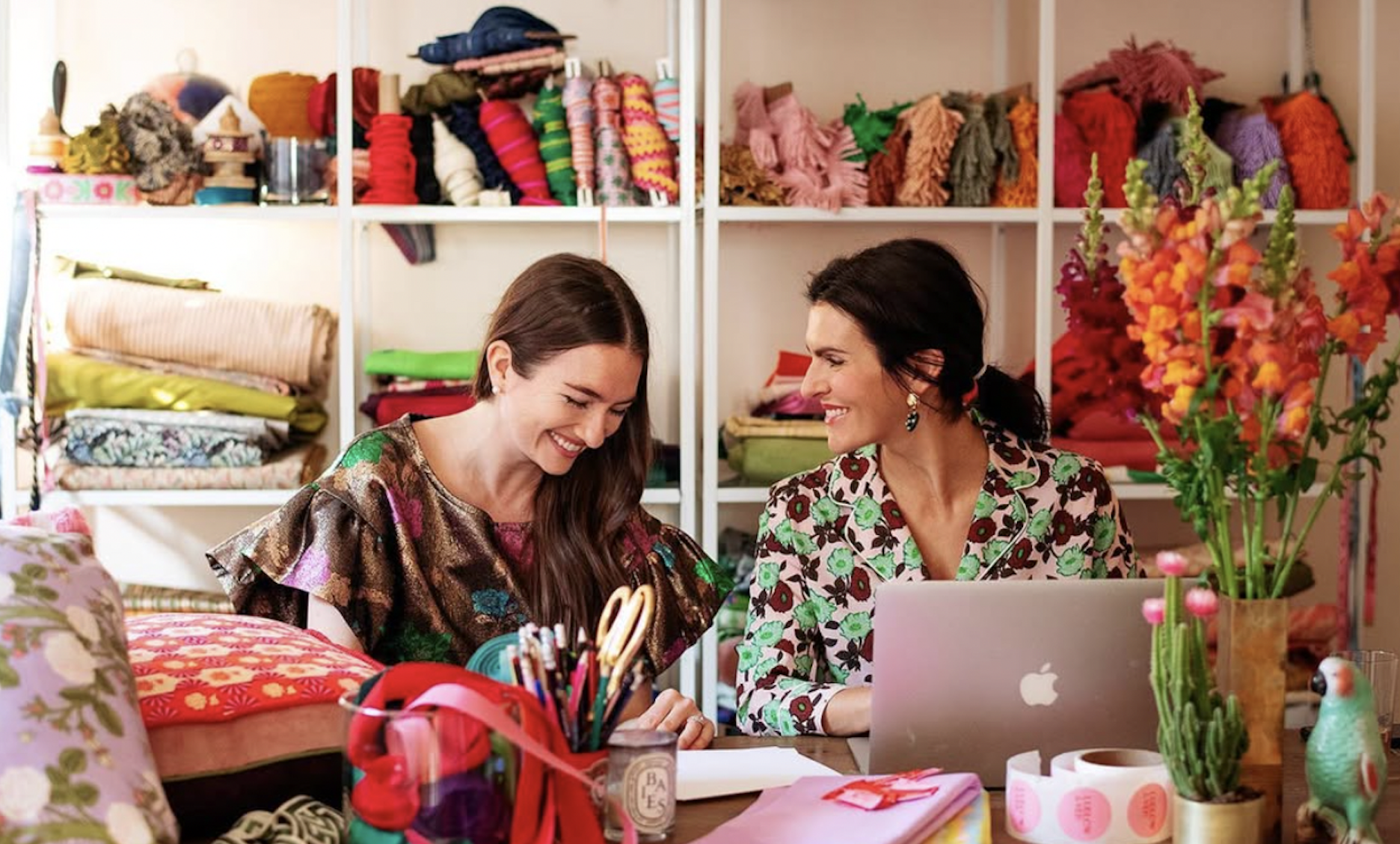
    First of all, I would like to acknowledge the women who make up the majority of the fantastic team at Cowley Abbott, starting with Partner and Vice President Lydia Abbott, and my colleagues Anna Holmes, Catherine Lacroix, Nicole Plaskett, Sydney Rodrigues and Julia De Kwant. Our unique combination of expertise, professionalism, creativity and organization make the auction house excel in the industry. Lydia and Anna have also formed a women’s group of clients, professionals and colleagues in the art world, who meet regularly for exhibition tours. Last spring, Lydia and Anna hosted a panel at Cowley Abbott on the topic of women in the Canadian art industry. I look forward to being a part of this initiative as it grows further, and please contact us if you wish to be a part of this group!

    I recently read a fascinating article in The New York Times that resonated with me in many ways. Entitled “Gathering Force in the Art Market: Female Collectors”, the article states that with women controlling an increasing share of global wealth, they are spending more money on art than men are. The author also notes that women are particularly thoughtful when collecting art, focusing on nurturing artists careers, or highlighting historically underrepresented artists. I have noticed firsthand that the next generation of collectors — particularly millennials, and particularly women — are driven less by speculation or “trophy names” and more by shared values, substance, and story. In Canada, this has translated into strong engagement with Indigenous and women artists who were long overlooked by the market.

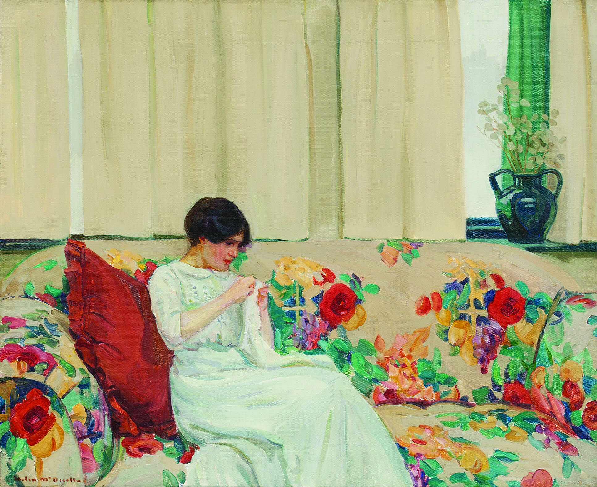
    The New York Times article also mentions how there is a growing presence of women on museum boards and acquisition committees, and thus are influencing exhibitions and collecting practices. Museums in Canada and abroad are showing more exhibitions devoted to women artists than they did over the last few decades. The recent exhibition Helen McNicoll: An Impressionist Journey, was held at the Musée national des beaux-arts du Québec and the Art Gallery of Hamilton, and soon will be presented at the National Gallery of Canada. Cowley Abbott was a proud sponsor of the Hamilton exhibition and we were thrilled to see The Chintz Sofa again – one of the highlights of our December 2023 auction of An Important Private Collection. The show brought together dozens of works in what was described as the first major retrospective of McNicoll’s work in about a century.

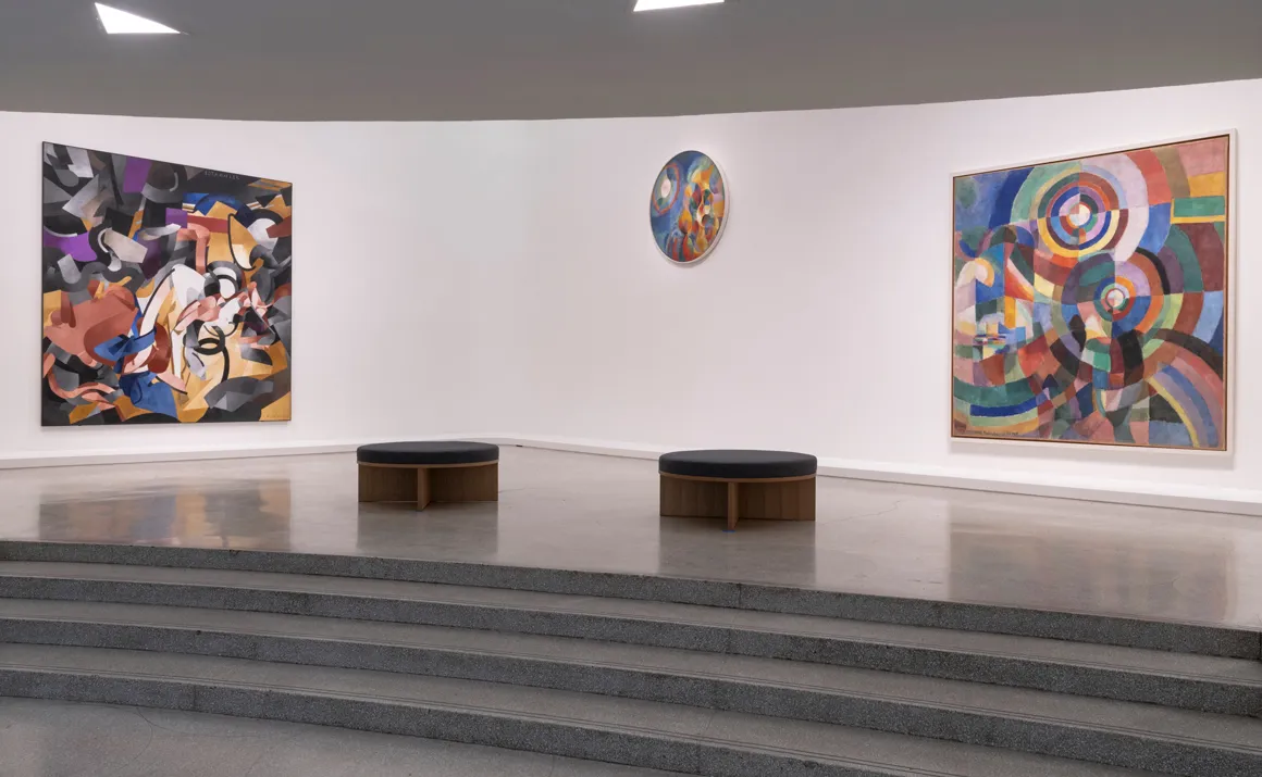
    Similarly, Joyce Wieland: Heart On, organized by the Montreal Museum of Fine Arts and the Art Gallery of Ontario, was the first full retrospective devoted to Wieland in nearly forty years. The exhibition assembled more than 100 works across media—painting, collage, textiles, prints, and experimental films—to show the breadth of her practice and position her as a major figure in twentieth-century art and film. Curators emphasized themes that feel particularly resonant today: feminism, national identity, social justice, and environmental awareness. 

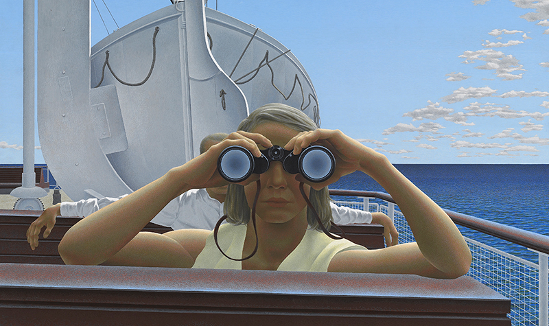
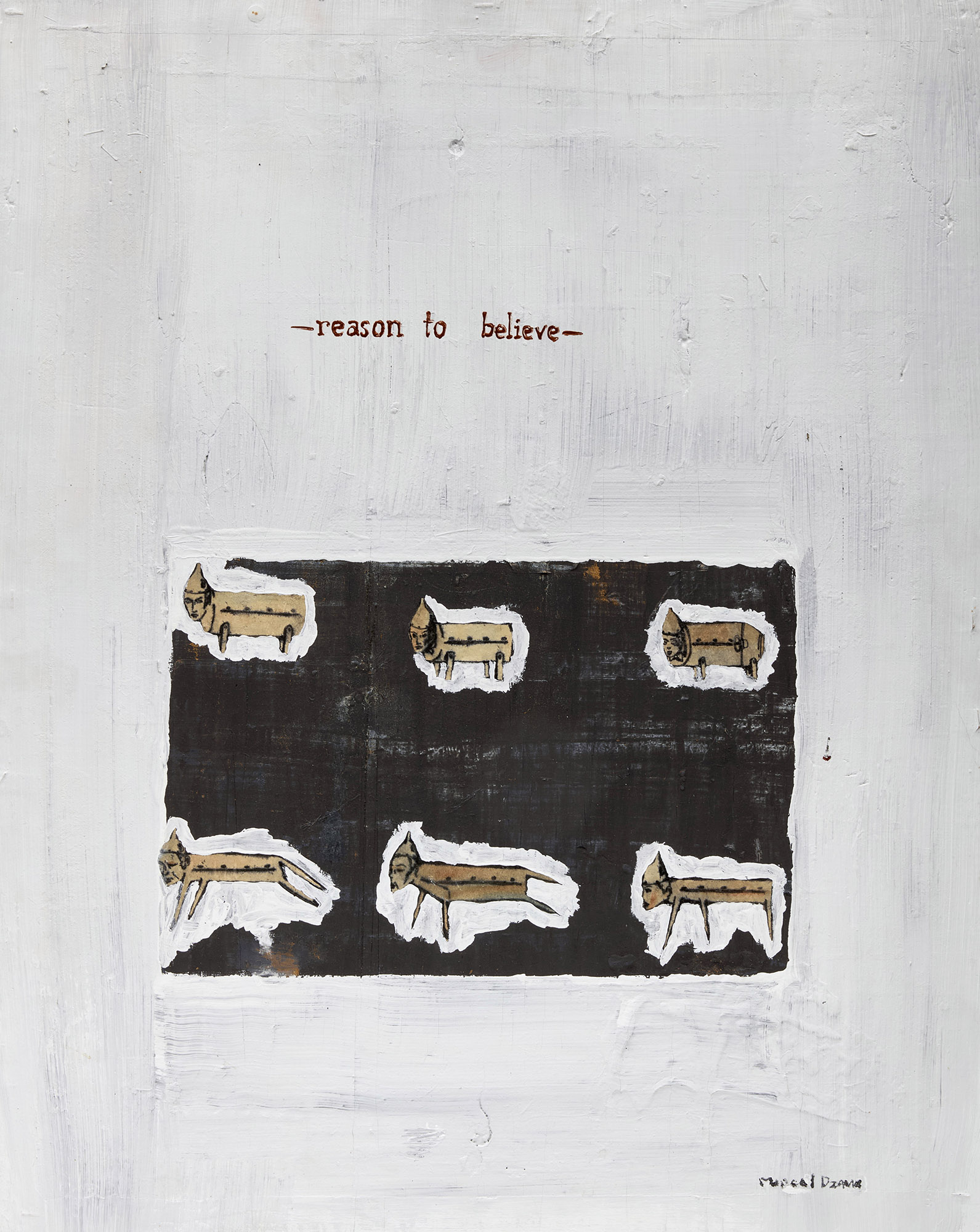
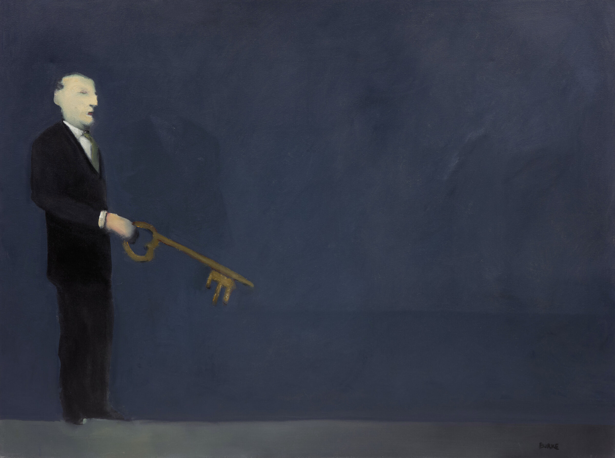
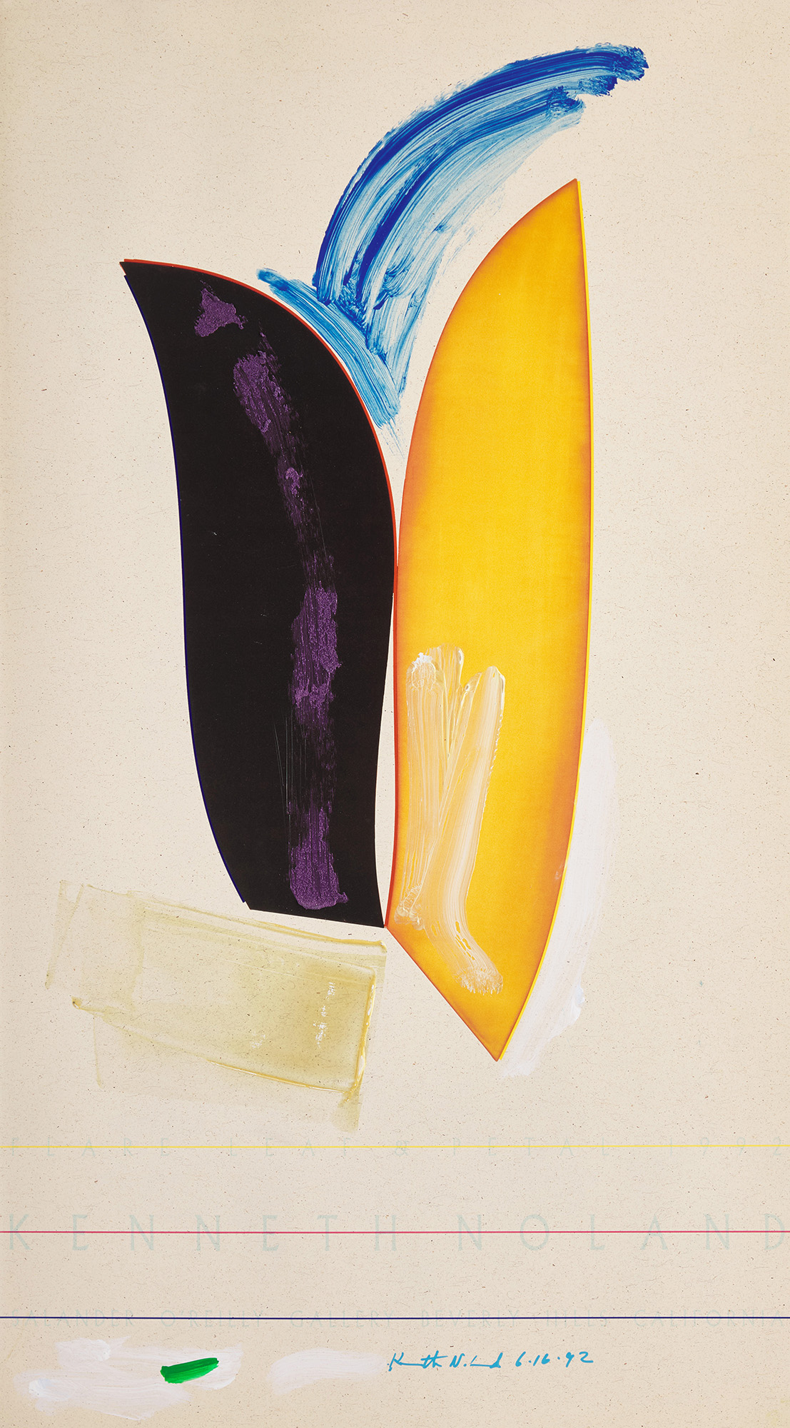
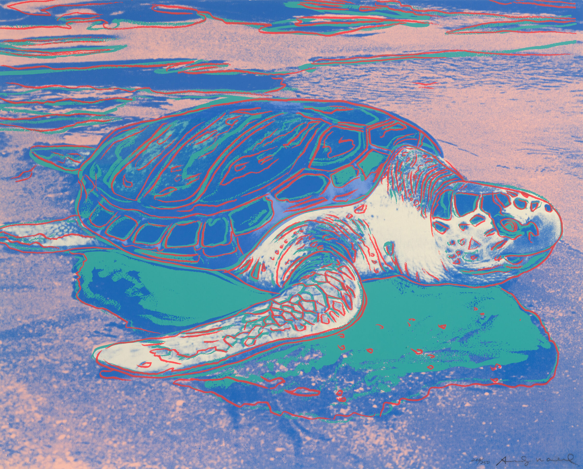
    For the past four years, Cowley Abbott has been organizing online auctions dedicated to women artists every March, due to high demand and in honour of Women’s History Month. These sales have proven to be very popular with collectors. This year, I feel we have a particularly strong selection of historical, post-war and contemporary artists in the auction, which is entitled “Celebrating Women Artists” and runs from March 10th to 24th, 2026.

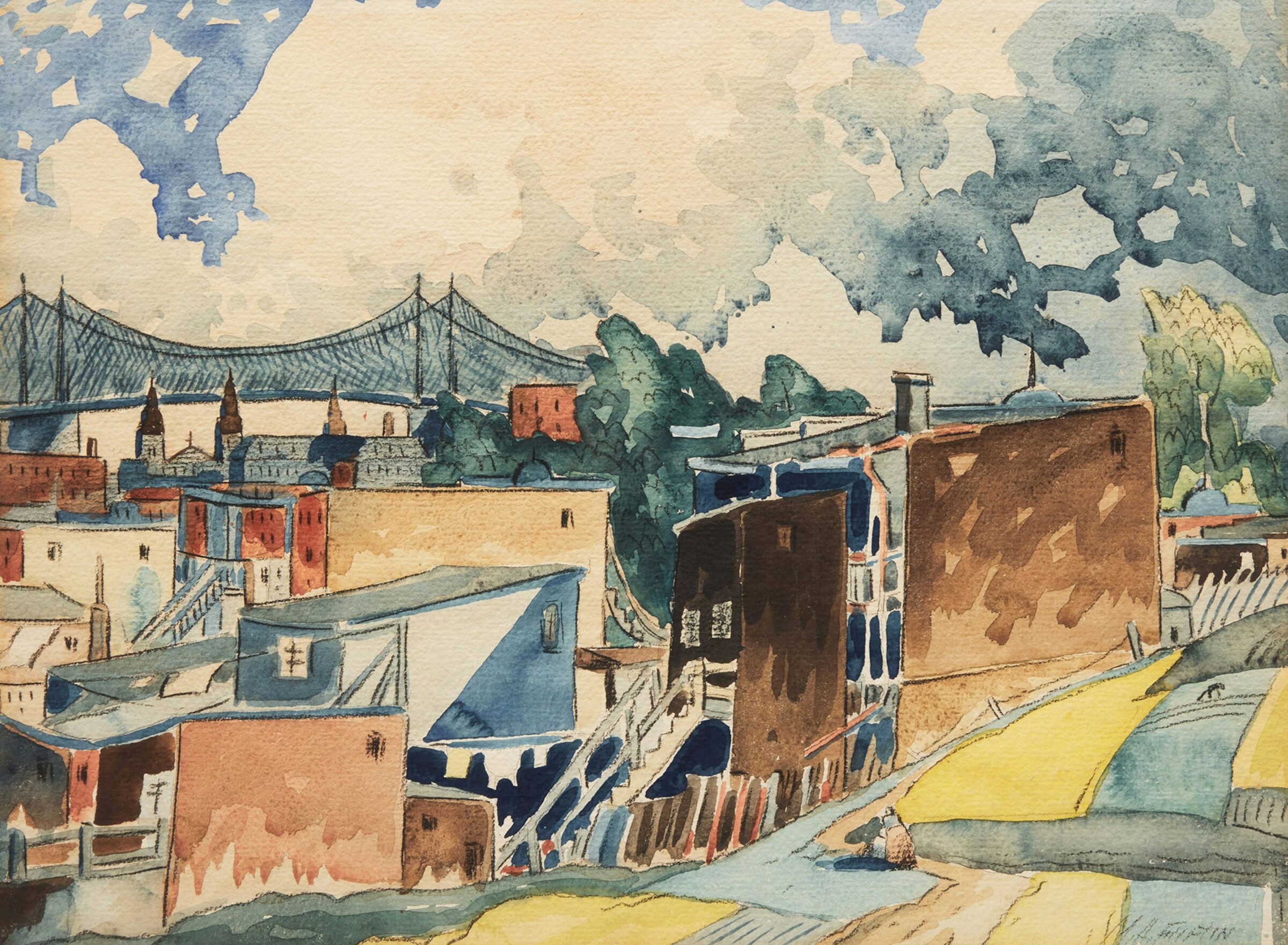
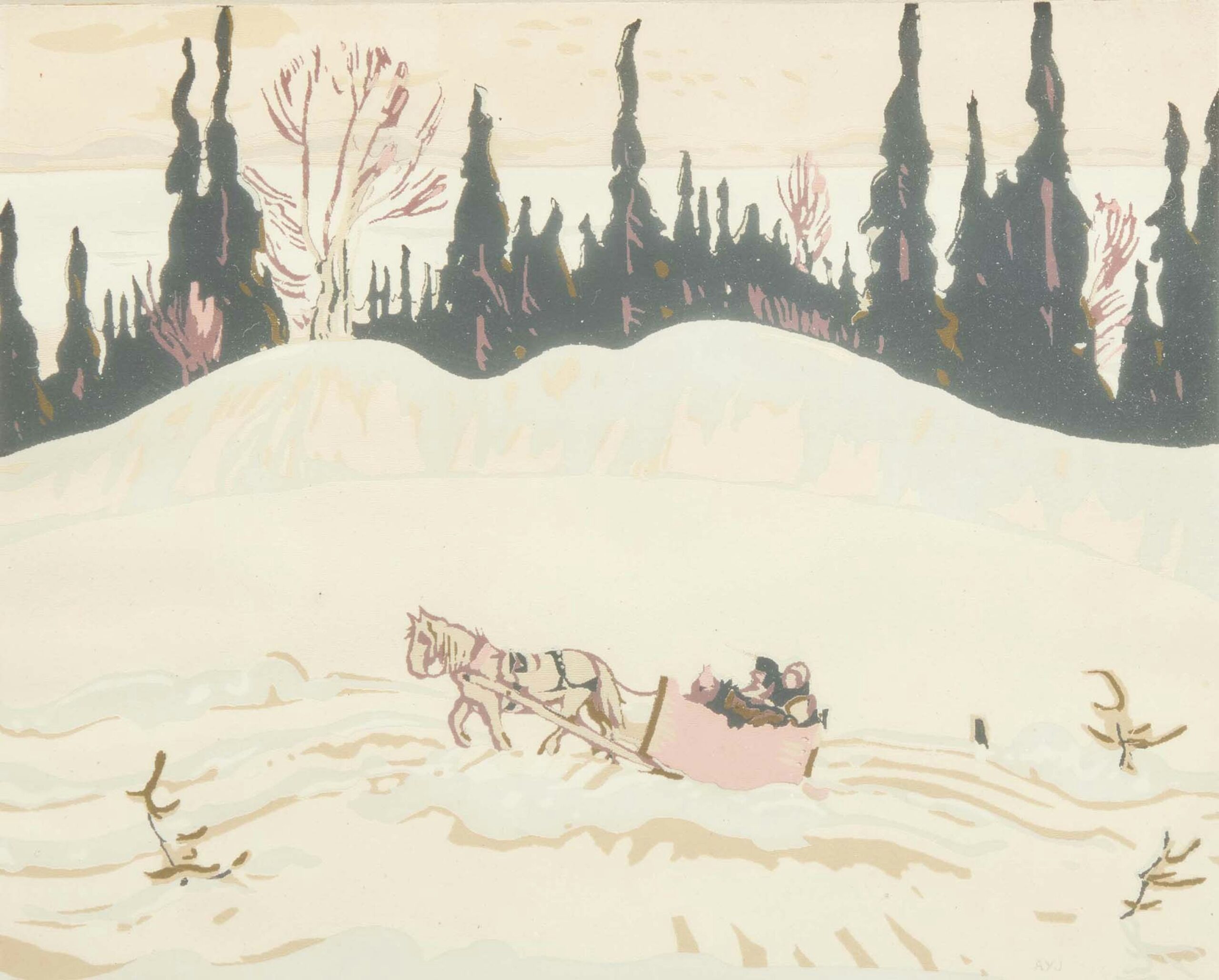
    A highlight of the auction is a beautiful mother and child portrait by Canadian painter Mary Alexandra Bell Eastlake (1864-1951). Although not exclusively a figure painter, the artist was known for her depictions of women and children in domestic outdoor settings, which was deemed an acceptable subject for female painters of the time. Eastlake’s paintings have drawn very strong interest in recent years, with When Spring Rides Through the Woods selling for $96,000 in this past November’s live auction, and In The Orchard setting the auction record for Eastlake in 2023, achieving a price of $168,000.

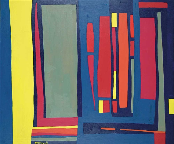
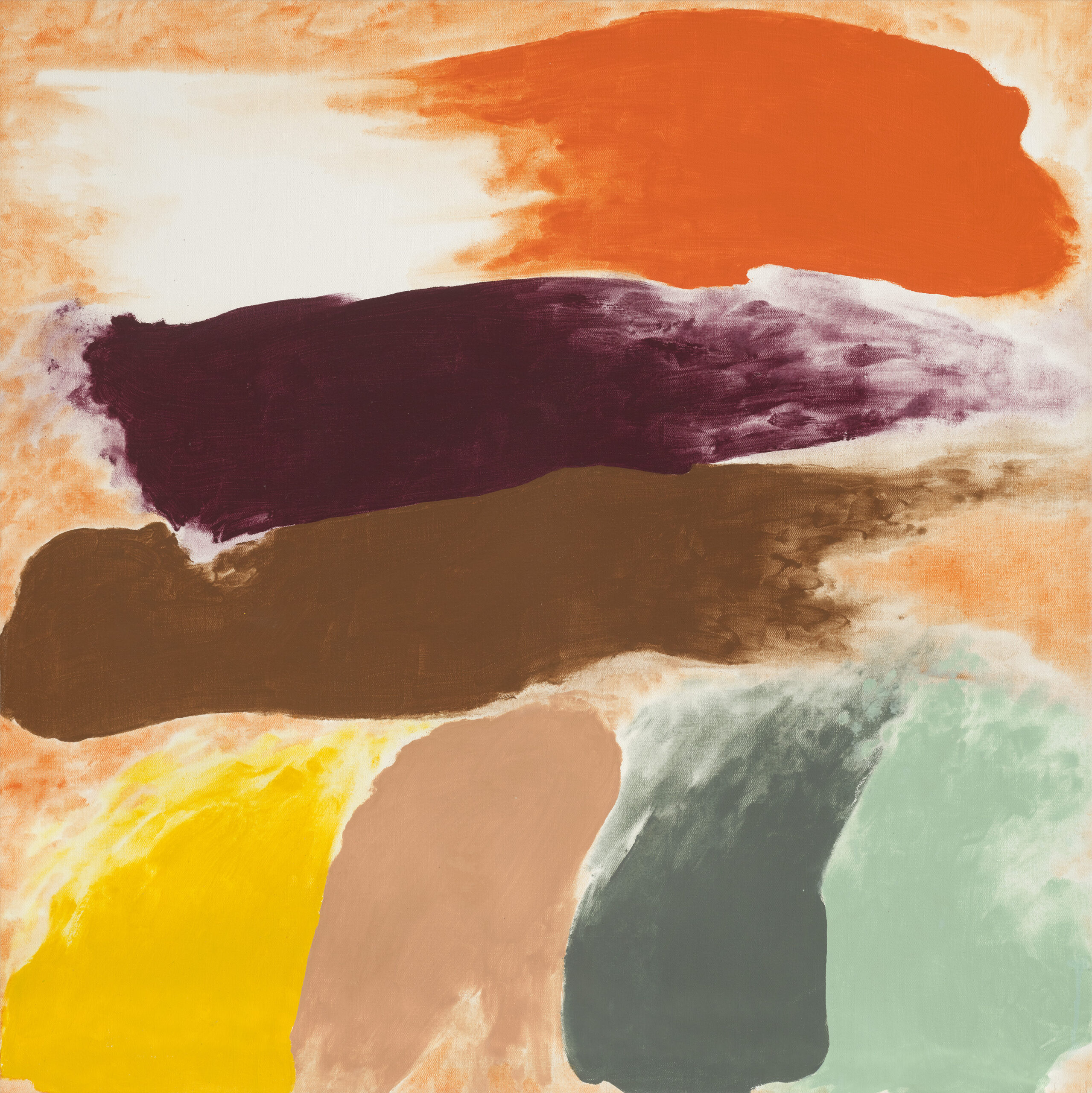
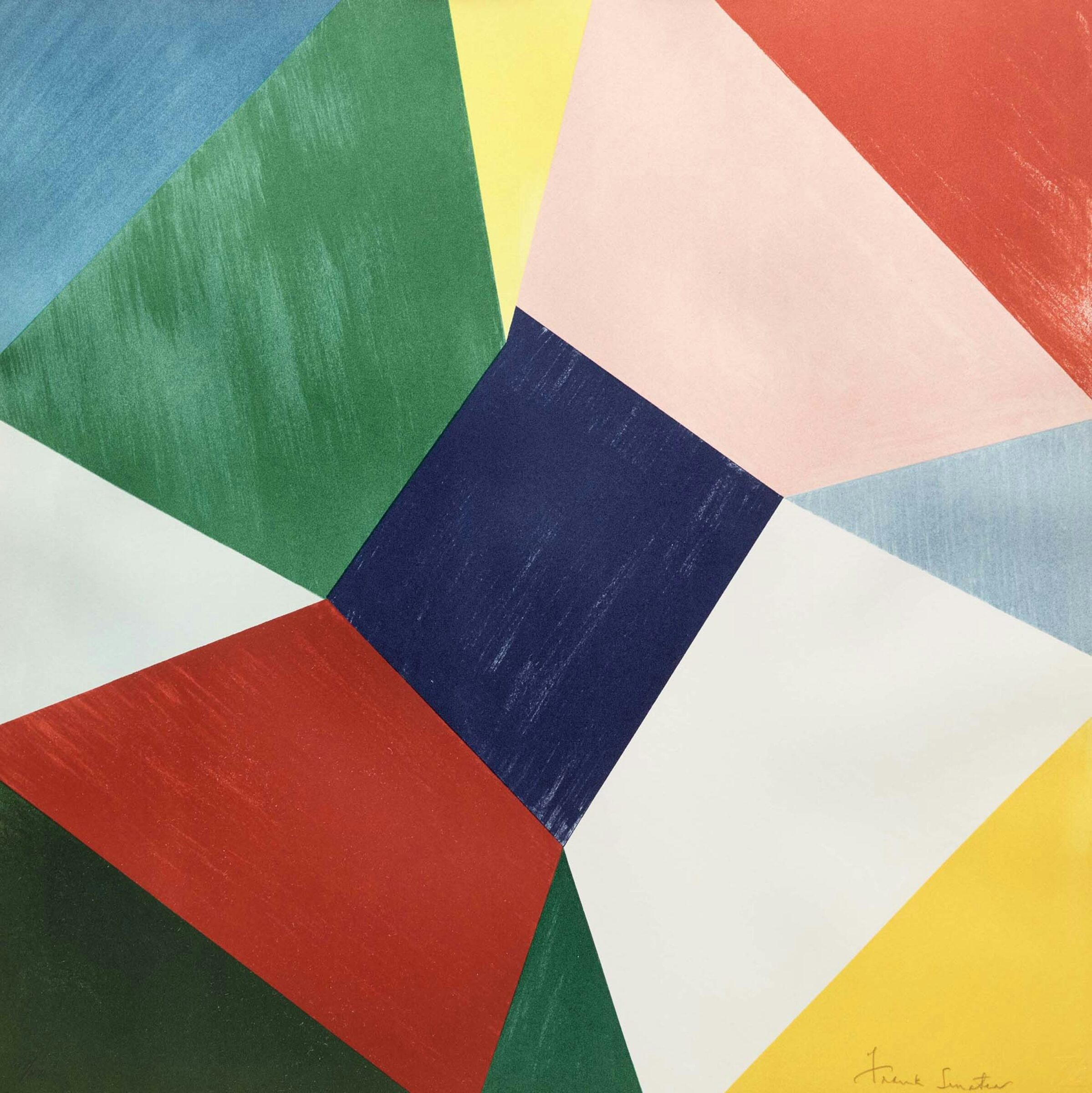
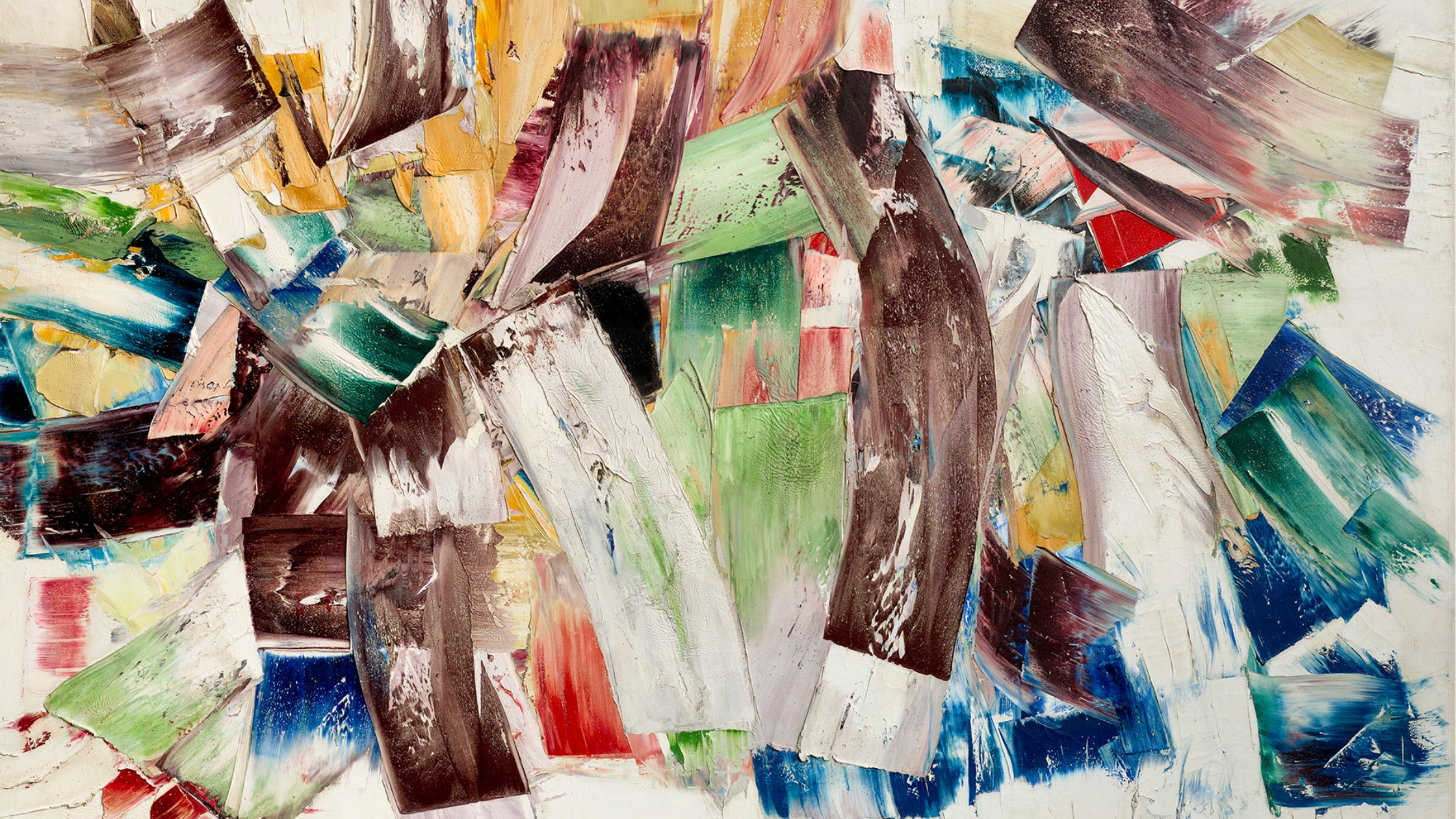
    Two post-war highlights in the auction are abstract paintings by Quebec artists Marcella Maltais (1933-2018), and Lise Gervais (1933-1998). Both women emerged in the 1950s–60s Quebec art scene, following the influence of Paul-Émile Borduas and the Automatistes while developing their own personal forms of lyrical abstraction.

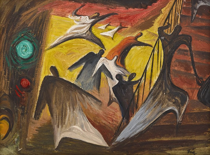
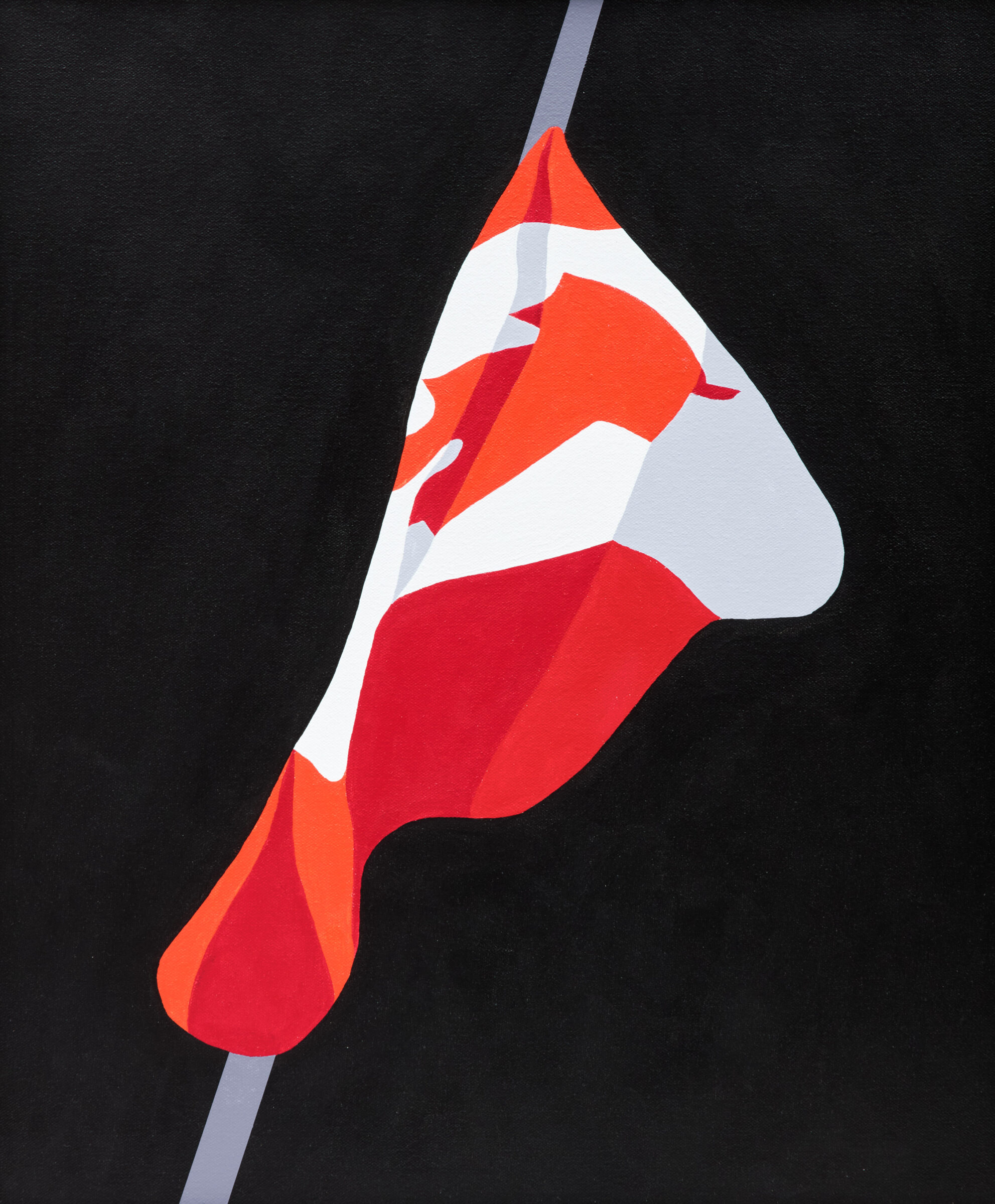
    We are excited to have a charming embroidered crest by Joyce Wieland in the auction, entitled The White Snow Goose of Canada. It was produced in 1971 while the artist was experimenting with a wide range of materials and exploring ideas of tactility in art. Her work was deeply political, addressing nationalism, feminism, and ecology. This White Snow Goose of Canada crest brings these themes together, reflecting the artist’s interest in their interconnectedness.

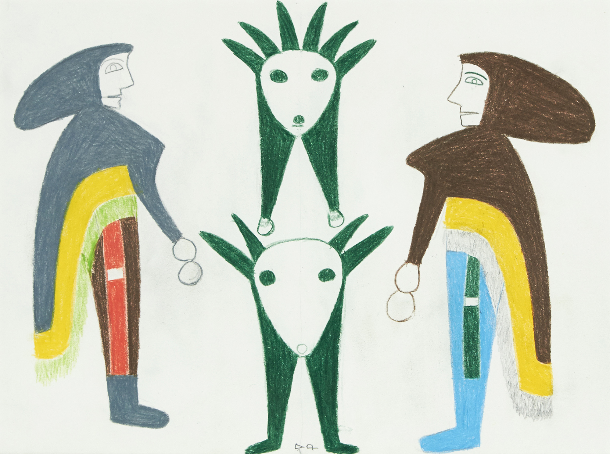
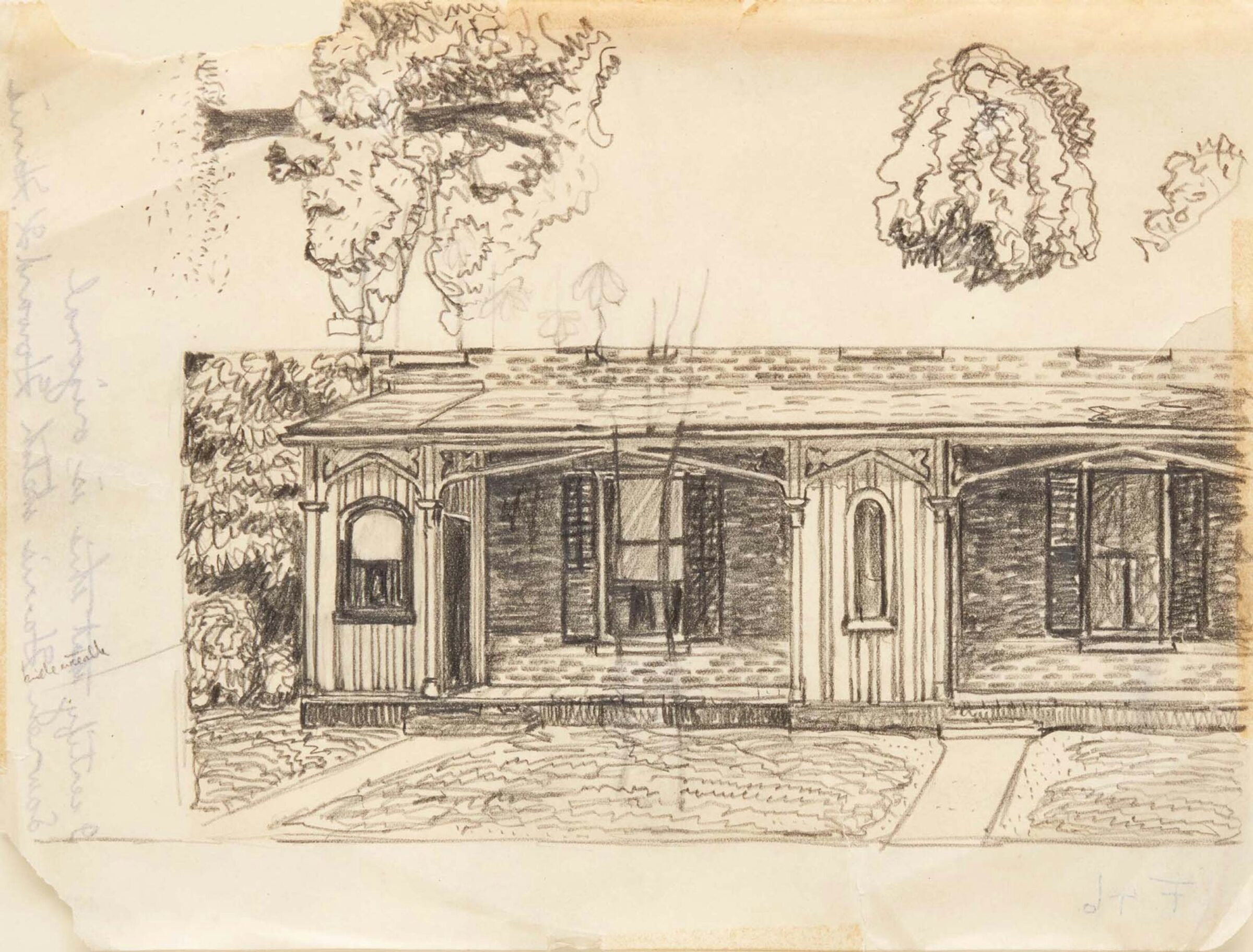
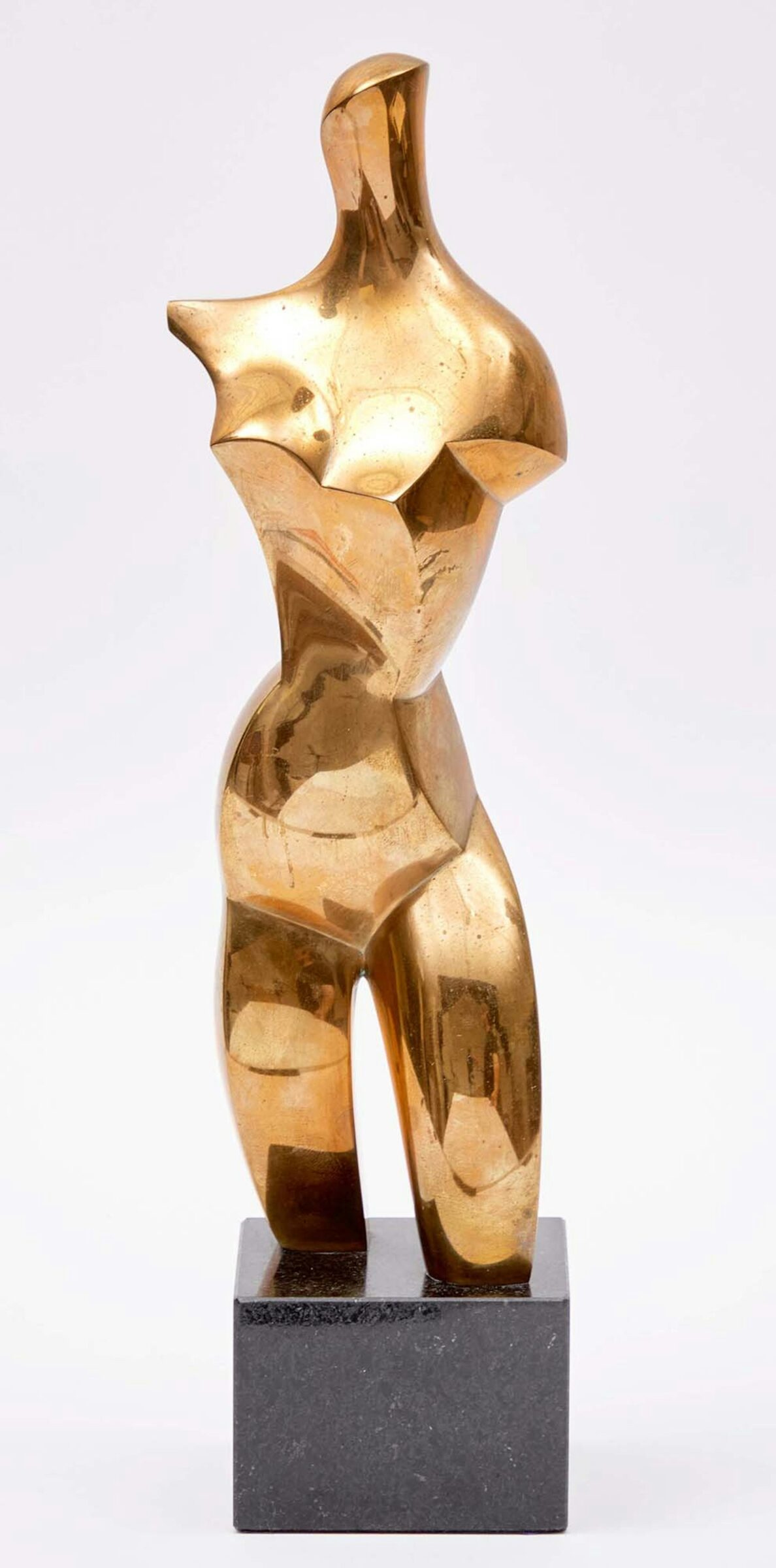
    Another highlight of “Celebrating Women Artists” that I would like to draw attention to is a collection of works by Anne Kahane (1924-2023), an Austrian-born Montreal sculptor known for her expressive figurative sculptures exploring themes of human suffering, resilience, and social justice. She worked during a period when women sculptors were relatively rare, and created numerous public monuments across Canada. Kahane is now recognized as an important figure in Canadian sculpture, yet she is still not widely known to the public. However, the Montreal Museum of Fine Arts is organizing an exhibition on her work, opening in November 2026. Cowley Abbott is excited to have four lots in our auction from the estate of Anne Kahane, including brass sculptures and colourful woodblock prints.

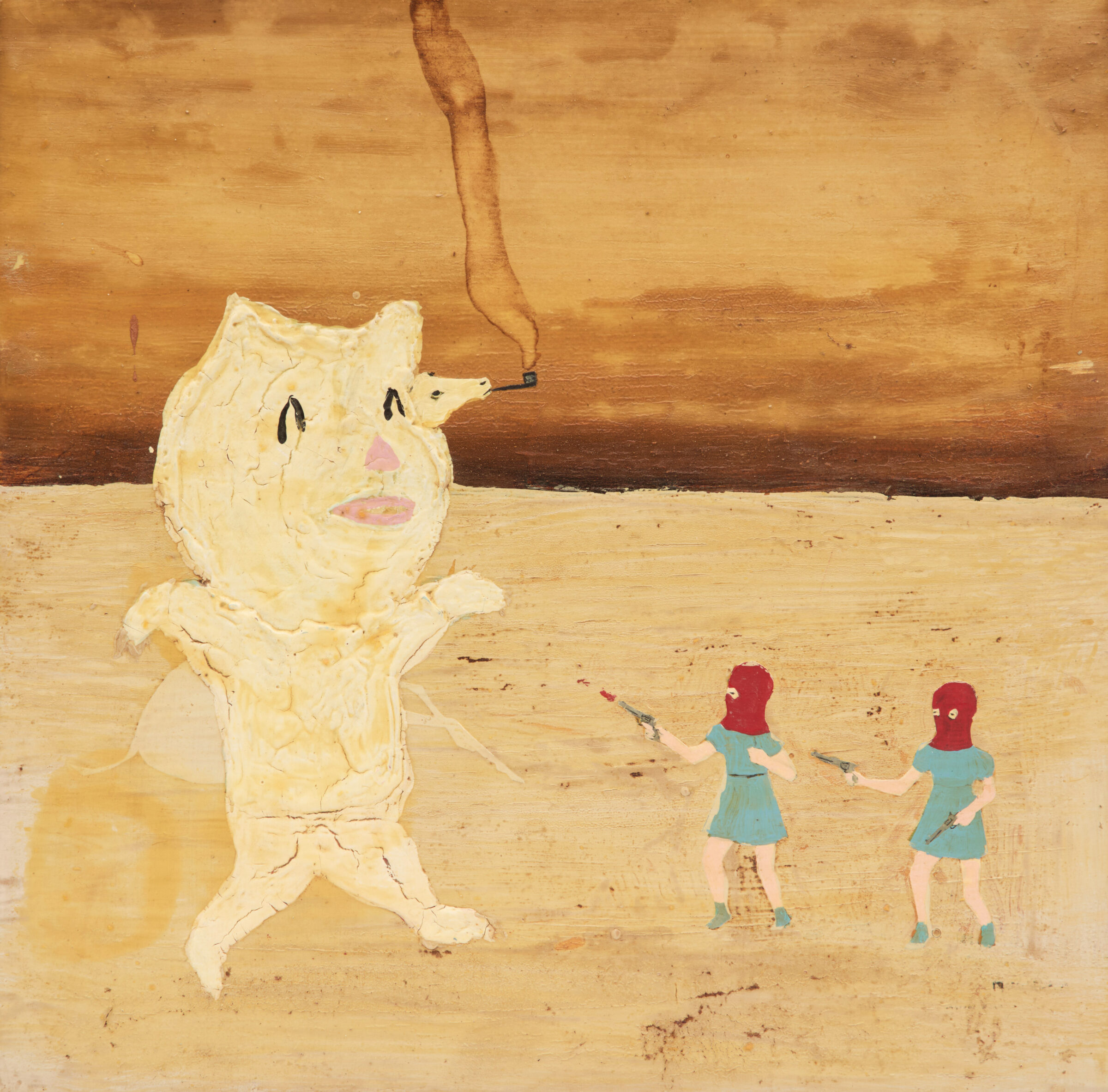
    I invite you to browse the auction for more compelling works by Canadian women artists. It is inspiring to see the growing recognition of these artists and the many women helping to shape the future of the art world in Canada and worldwide.

  • What’s on in January

    January at Cowley Abbott: Online Auctions & A New Bidding Experience, DesignTO and Art Collecting Conversations

    January Online Auctions
    Cowley Abbott is pleased to present a captivating variety of works offered over six online sessions this month. Our January Online Auction features an early figurative painting by Jack Bush, a selection of works by Canadian pop artist Charles Pachter, and a nineteenth-century vista by Marc-Aurèle de Foy Suzor-Coté. Bidding will conclude on Tuesday, January 27th.

    We are also excited to be participating in DesignTO this year as an Independent Project. To mark the occasion, we will be hosting a breakfast preview and gallery tour on Saturday, January 24th, from 11:00 am to 1:00 pm. All are welcome! We look forward to connecting with members of the design community and with anyone who enjoys living with original art. Please RSVP to [email protected]

    New Online Bidding Experience
    We are pleased to introduce an improved online bidding experience. When you create a profile on our website, your Auction Mobility bidding account is created at the same time, using the same login and password for both platforms. If you already have an Auction Mobility account from our live auctions, it will automatically link to your new Cowley Abbott profile, making it easier than ever to participate in our sales. As always, our team is available to assist throughout the auction period; and please don’t hesitate to give us a call for support with the new bidding platform.

    Conversations on Art Collecting
    Art Specialist Katherine Meredith continues her ongoing dialogue with voices from the Canadian art and design world, exploring the many ways people engage with and collect art today. United by a shared goal of making the art world more approachable and accessible, she recently sat down with art advisor Megan Paterson of Aurelia Fine Art. Below are select excerpts from their conversation.

    Why do you think original art should be an important part of everyone’s home and life?

    Art connects us and consoles us in ways that there aren’t words for. It inspires us and it validates our identities and struggles that are hard to share with each other. I might not be able to tell anyone that I’m sometimes horrified by existence but there are numerous artworks I can turn to that will assure me I’m not alone.

    What advice do you give to people who are new to art collecting?

    It’s all about what speaks to you and there really aren’t any wrong choices. The only place you can go wrong is not being properly educated about your choices so it’s essential you work with trustworthy professionals so you know exactly what you’re buying.

    What are some challenges you find with your role as an art advisor? 

    The biggest challenge is trying to explain to people what an art advisor does (lol) but beyond that, challenges are ultimately my opportunities. A lot of people want me to talk about the challenge of imposing my taste on my clients but I don’t see that as my job. My job is to encourage them to trust their own taste, help clear that path for them and make sure they’re fully and properly educated and supported on each decision. 

    If you could choose a work of art from Canadian art history, what artwork would you choose and why?

    My favourite painting to visit is the big Kurelek in the AGO of the scraggly solitary tree looking down at all the kids playing, but I’d also take pretty much any painting by Alex Colville or Marion Nicoll. I know you said one but that’s an impossible request of any art person!

    Which artworks from our January online auction do you have your eye on, and why do they speak to you?

    Both Marcel Dzamas. I was an early 2000s indie music girl and fell in love with his artwork on the Weakerthans and Beck album covers. I also love words and therefore text-based art so “Reason to Believe” really appeals and it’s probably not related but reminds me of the Rod Stewart song, which I adore. 

    The Brian Burke. I’d actually never heard of this artist before but love how dark and mysterious it is and how it sucks me right in just trying to figure out what the hell the narrative is there.

    Yuri Dojc, “Sweet Stillness”. I’d also never heard of this artist before but I just simply like the image and don’t really have an explanation why beyond that!

  • A Closer Look at Highlights of the Important International Art: The Day Auction

    A Closer Look at Highlights of the Important International Art: The Day Auction

    Our specialists present highlights from our current online auction, featuring prominent twentieth-century artists working across a range of mediums. From standout works by Abstract Expressionists and Color Field artists to a selection of watercolours and drawings by Otto Dix, our Day Auction charts the innovation of artists at the top of their craft.  

    Friedel Dzubas’s Triumphant Return to the Square Format
    Lydia Abbott, Vice President, Director of Fine Art

    Friedel DzubasAfterglow, 1976. Estimate: $40,000 – 60,000

    Afterglow is a magnificent example of Friedel Dzubas’s return to the square format in the 1970s, which felt more normal and organic to him. With the square, he felt he could enter the picture more easily: “I also was comfortable standing into [the surface] and painting around it, which I did in the beginning, and by lying down. I built all kinds of construction to not let it touch the surface, but in the beginning I walked into my square and I painted in a certain logistical, with a certain strategy, painted whatever imagery I wanted to paint.”

    This work truly exemplifies Dzubas’s commitment to exploiting pigment, image, and brushstroke to activate the surface of his paintings. 

    Kenneth Noland’s Classic Purity of Form
    Peter Ohler, Director of Private Sales

    Kenneth Noland, Salander O’Reilly Gallery Exhibition Poster, 1992. Estimate: $5,000 – 7,000

    This unique lithograph pays tribute to Kenneth Noland’s mature works, which follow in the footsteps of Piet Mondrian, “in their classic purity, chromatic breakdown of space and the optical effects of forms which seem to advance and retreat while simultaneously occupying a single plane.” 

    Following his break in the 1950s with Abstract Expressionism, Noland began producing paintings with geometric shapes and bold colour combinations. Elements from his Flares series can be gleaned from this work, with the sinuous bands evoking the complex interplay of colour and form also present in the translucent plexiglass strips.


    Otto Dix’s Masterclass in Pastoral Landscapes
    Perry Tung, Senior International Art Specialist

    Otto Dix, Steckborn, Switzerland from Hemmenhofen, 1949. Estimate: $7,000 – 9,000

    When Julian Dix, the artist’s grandson, sent images of his collection, I was struck by how different these works were, presenting idyllic pastoral scenes and a remarkable study for the 1920 painting Cats.

    It was a joy working with him and learning about this other side of the German artist. As his grandson describes: “These works of my grandfather have been in our family since his passing in 1969, and there is an intimacy about them that reveals the artist’s hand, and offers a rare glimpse into Otto Dix the man. These are what I categorize as the quiet works of my grandfather—no provocation, and away from the spotlight of political scrutiny.”


    A Timeless Still Life by Robert Mapplethorpe
    Katherine Meredith, Senior Specialist and Appraiser

    Robert Mapplethorpe, Apples and Urn, 1987. Estimate: $15,000 – 20,000

    I was instantly drawn to this photograph for its balance of elegance and restraint. Robert Mapplethorpe elevates everyday objects into something timeless and sculptural. The velvety blacks and perfectly controlled composition create a sense of stillness and quiet drama. It is a work that feels both classical and contemporary. I like how it is an unexpected subject matter for the artist. Mapplethorpe’s still lifes reveal his obsession with form, balance, chiaroscuro, and classical beauty, without the charged emotional or cultural context of his figurative work.

    Francis Bacon’s Poignant Meditation on Bullfighting
    Catherine Lacroix, International Art Specialist and Appraiser

    Francis Bacon, After Study for Bullfight #1, 1969 (Sabatier 10). Estimate: $20,000 – 30,000

    This striking work was inspired by Francis Bacon’s triptych of bullfight paintings from 1969, which celebrates this ancient ritual that remains popular in Spain. This colour lithograph was initially issued as the main image on the poster advertising Bacon’s retrospective of paintings in October 1971 at the Grand Palais in Paris.

    His series of bullfight scenes pay homage to Bacon’s enduring interest in exploring the intersection of human and animal, of the wild brutality that animates all of us. By capturing the beauty within the liminal state between life and death, the Irish-born artist offers a poignant meditation on the true nature of mankind.

    Discover other highlights from our Important International Art: The Day Auction, which will close on November 28th at 12 PM (EST).

  • In Conversation                      with Ludlow & Veh

    In Conversation with Ludlow & Veh

    Join Art Specialist Katherine Meredith as she speaks with Simone Ludlow and Erika Veh, designers of handmade one-of-a-kind cushions using vintage fabrics. Their company Ludlow & Veh also offers interior design and art advisory consultations. With backgrounds in art history, auctions, design and marketing, they share Katherine’s passion for collecting art with patience and intention.

    How would you describe your design style?

    Slow design. Not all the same style, not all the same era. Balance, texture, layers, not matching, eclectic. We love including vintage pieces and antiques, something with a patina and a story to it. If you do it intentionally and lovingly, it will work. Never feel like something is done. There is an expression that goes something like- “a room is only finished when you run out of money!”

    Where do you find inspiration?

    Art, nature, travel, film. Pedro Pascal’s apartment in the recent film Materialists, and movies like Home Alone, The Shining, I am Love, and The Birdcage. We are inspired by place and time. Matisse interior paintings. Unusual colour combinations we spot on the street or in nature.


    Why do you think original fine art is an important part of interior design?

    It’s a layer that finishes everything. Art adds a depth and a tone of your own personality to your home. There is something lively to a home filled with original art. It takes emotion. You don’t want your house to look like a staged showroom, or the same as the house down the block. A mass-produced print from a box store doesn’t elicit pleasure, it just fills a wall. Art adds personality, meaning, joy.


    What advice would you give to someone who is new to art collecting?

    Buy what you love, and then your house will be a reflection of your personality. It doesn’t matter if the artist is new, local, unknown or from the past. It doesn’t have to be expensive. It should be something that speaks to you. Don’t set out to buy art that matches your decor. If you love it, it will work and you will find a place for it. Have a bit of patience. People want things so quickly and so effortlessly, but it means so much more when you take your time and put effort into it, and it shows. You feel better about it because it’s a reflection of you.

    How do you approach auctions specifically, in comparison to other ways of acquiring art? Do you find any advantages or challenges?

    Advantages: you see such a broader scope of art, and artists you wouldn’t normally see or necessarily seek out. Better value. There’s no inflated art gallery commission – the price is what the market will stand.

    Challenges: the high volume of artwork – you have to have the patience to look through the entire listing. Everything at auctions is framed “as-is” and it can be difficult to imagine a work in a new frame that is better suited to your space. But framing is everything and can really transform the art and the room!


    If you could choose any artworks from Canadian art history to put in your own living room, what would you choose and why?

    Erika: There are many Canadian artists I admire and support. If I have to select just one piece – I would have to say Horse and Train (1954) by Alex Colville. Its haunting simplicity captures the tension between nature and machine, which feels very relevant at this time in the world. It also evokes a sense of Romanticism in the solitary, noble horse confronting the unstoppable force of modernity. A reminder that life is constantly moving, changing, and that inevitably time escapes us all. 

    Simone: This is almost impossible to answer, so I’m simply going with immediate impulses. I love Alex Colville, and I especially love his works featuring dogs, so perhaps Stove. It’s such an intimate and tender piece, and it captures so well the simple (and magical) joy of sharing your life with a dog.


    I also love Jessie Oonark, so almost anything by her. I love her use of colour, and the bold, graphic nature of her work.

    Untitled by Jessie Oonark. Sold by Cowley Abbott in 2014.

    Margaux Williamson’s more recent works of interiors are also favourites. As I mentioned before, I gravitate to pieces featuring interiors, and Margaux’s are so interesting and I find them entirely
    captivating.

    And I mean, who wouldn’t want a Lawren Harris iceberg?

    If you could choose any artworks from ALL of art history to put in your own living room, what would you choose and why?

    Simone: This is truly an impossible question! Based entirely on immediate instincts – The Little Street by Vermeer at the Rijksmuseum. I also have always loved David Hockney; he’s so joyful and loves life, and that is so apparent through his work. I saw his recent retrospective in Paris, and I am particularly drawn to the paintings of his home in LA and his British landscapes. Paul Nash’s 1930’s painting Harbour and Room at Tate Modern has also been a constant fascination. I also absolutely love the art and design from the turn-of-the-century Vienna Secession movement led by Gustav Klimt.


    Erika: If I could select a piece of art for my home, it would be Sonia Delaunay’s Electric Prisms (1914). I had the pleasure of viewing it in New York, Guggenheim’s exhibition “Harmony and Dissonance: Orphism in Paris 1910-1930”. Both the scale and bold rhythmic motions of colour have stayed with me ever since. I have also always carried the same admiration for the Nike of Samothrace at the Louvre, a timeless emblem of victory, hope and forward momentum.

    Which artworks from our September online auction do you have your eye on? And how would you style them in a room?

    Simone: What a wealth of beauty to choose from! One selection would be Lawren Harris’ Study of a Verandah. I love witnessing the traces of an artist’s process, and in this piece the sketches of the trees and the script on the paper’s reverse delight me. The verandah itself is also so inviting – the architecture draws the viewer in. I would love to sit there and have a glass of wine.

    Lot 199. Lawren Harris, Study of a Verandah. Graphite. Estimate: $3,000 – $4,000

    I also gravitate to Fortin’s Montréal. I love his use of colour and the somewhat chaotic, dense scene he has created. I went to school in Montréal, and this piece evokes the feeling of the city for me – layered, busy, a bit gritty, beautiful, full of life.

    Lot 125. Marc-Aurèle Fortin, Montréal. Watercolour. Estimate: $10,000-15,000

    I also must include some more graphic pieces – I always love them for balance. The colours in Fly me to the Moon by Frank Sinatra (who knew?) are beautiful, and I appreciate the feeling of motion that it suggests. Philomène by Jacques Hurtubise echoes the Sinatra piece in an interesting way, and I would love them displayed together. The blue and red are arresting, and I love their juxtaposition with the off-white ground.

    Lot 17. Frank Sinatra, Fly Me To The Moon. Colour lithograph. Estimate: $900-1,200

    Erika: I  am in love with Jim Ritchie’s female figure sculpture from the Quebec lot! It inspires me because it reminds me of the beauty, resilience and softness I recognize in the women I cherish in my life. 

    I also have a black and white striped marble plinth where this sculpture would look so stunning! 

    What I love about Winter Sleighing Scene by A.Y. Jackson is that, while the artist captures a distinctly Canadian winter scene, he departs from the expected palette of icy blues and greys, choosing instead a feminine blush for the sleigh and lively touches of pink in the trees. A choice that brings unexpected warmth and a smile to the winter scene. 

    Lot 207. A.Y. Jackson, Winter Sleighing Scene. Colour serigraph. Estimate: $600-800

    I was also drawn to Fly Me To The Moon by Sinatra for its bold shapes and vibrant interplay of colour, which is a style reminiscent of one of my favourite short lived art movements; Orphism  – with its rhythmic energy and sense of movement.  And perhaps also because the artist was also the infamous crooner! 

    For more information on Ludlow & Veh, check out their website and Instagram. And for further conversation on collecting art with intention, join Simone, Erika and the Cowley Abbott team for our 5 à 7 on Thursday, September 11th. RSVP at [email protected].

  • Collecting Guide: Prints by International Artists

    For new collectors, prints can offer an accessible entry point to begin growing your art collection, offering works at more affordable prices.

    Andy Warhol, Mick Jagger (F&S II.141). Colour screenprint on Arches aquarelle (rough) paper. Signed by the artist, numbered 13/250 and signed by Mick Jagger in the lower margin. Printed by Alexander Heinrici, New York. Published by Seabird Editions, London, England. Sold for $276,000

    1. What is a print?

    Prints are original artworks produced in limited numbers. They are often created under the artist’s supervision and in an edition. Prints and printmaking are broad terms used to describe:

    • Aquatint: An intaglio printmaking technique that creates tonal areas.
    • Drypoint: An intaglio printmaking technique that creates sharp lines with fuzzy edges.
    • Engraving: Incisions are made into a metal plate which retain the ink and form the printed image.
    • Etching: A printmaking technique using chemical action to produce incised lines in a metal printing plate, which holds the applied ink and forms the image.
    • Lithography: On a flat stone or metal plate, an image is created using a greasy substance that allows the ink to stick, while the non-image areas are treated to repel ink.
    • Mezzotint: An intaglio printmaking technique that creates soft gradations of tone.
    • Monoprint: A form of printmaking where the image can only be made once, making the technique closer to a drawing or painting. The term monoprint and monotype are used interchangeably.
    • Screenprint: A variety of stencil printing, using a screen made from fabric (silk or synthetic) stretched tightly over a frame. Also known as silkscreen and serigraphy.
    • Woodcut: A method of relief printing using a block of wood cut along the grain. The raised areas of the image are inked and printed, while the areas that have been cut away remain blank.
    Pablo Picasso, Sculpteur et deux têtes sculptées from the Vollard Suite (Bloch 157; Geiser 310 Bd). Etching signed lower margin. Sold for $9,600

    2. What are edition sizes and proofs?

    A print is a unique work produced in a limited edition, meaning only a specific number of impressions are made, and are usually signed by the artist. Each print is assigned an edition number, typically written as a fraction in the lower margin (for example: 25/50). The number on the left represents the individual print’s number, while the number on the right indicates the total size of the edition.

    The number of prints in an edition is key and limited edition prints are generally considered to be more valuable. The following abbreviations usually appear on works outside the numbered edition, such as:

    • A.P.: Artist’s Proof (or E.A. for épreuve d’artiste). Identical to the numbered edition and usually kept by the artist as a record of the print’s evolution.
    • P.P.: Printer’s Proof. Identical to the numbered edition and is an example for the printer or publisher the artist was collaborating with.
    • T.P.: Trial Proof. Used by artists and printers to see how the work is progressing before the official print run. 
    • E.P.: Experimental Proof. An experimental proof used by an artist as part of the creation process to be made into an edition.
    • C.P.: Color Proof. Used to test which colours best represent the artist’s intention.
    • H.C.: Hors Commerce, which translates to “not for sale”. These proofs were often intended for promotional use for galleries and dealers and are identical to the final edition.
    • B.A.T.: Bon à tirer, a French phrase meaning “good to pull”. It is the final proof reviewed by the artist before the edition is printed. There is generally only one B.A.T. and the printer relies on it so that the final edition is as the artist intended.
    Marc Chagall, L’Opéra (M. 715). Colour lithograph. Signed and inscribed “Épreuve d’artiste” in the lower margin. Sold for $31,200

    3. What are the different types of paper used in prints?

    In our catalogue description, specialists will indicate what type of paper a print is on and will mention if any watermarks are visible. Here are some examples:

    • Arches
    • BFK Rives
    • Hahnemühle
    • Japan nacre
    • Wove
    Roy Lichtenstein, This Must Be the Place (Corlett III.20), 1965. Colour offset lithograph on wove paper printed signature, dated 1965 (as issued) and signed in the lower margin; titled and dated on a gallery label on the backing on the reverse. From an unknown edition size. Published by Leo Castelli Gallery, New York. Sold for $22,800

    The selection of paper is an important part of the printmaking process, which can influence the appearance of the printed image. For example, Roy Lichtenstein was known for using readily available paper, such as thin poster paper, and Andy Warhol similarly liked using inexpensive paper for his Soup Cans during the 1960s to emphasize that they were meant for everyone.

    4. Why are catalogue raisonnés important?

    A catalogue raisonné is a published collection of an artist’s complete works, listing each work with its title, date, and a description of its physical properties, such as medium, size and signature. The various editions are listed, along with the names of the printer and publisher.

    Consulting the catalogue raisonné of an artist is, therefore, a necessary step for any serious collector to confirm if a print is a genuine work or not.

    Andy Warhol, Turtle (F&S II.360A), 1985 colour screenprint on Lenox Museum Board. Signed and numbered 248/250 lower right; titled and numbered on a label on the reverse. Printed by Rupert Jasen Smith, New York; published by CBS, Inc., Los Angeles, California. Sold for $114,000


    5. What are common condition issues to look out for?

    Beyond the authenticity of a print, a collector should always consider its condition before making a purchase as it will impact its value. The most common imperfections can include the following:

    • Creasing: An unintentional and permanent ridge or fold in the sheet of paper.
    • Fading: Loss of brightness or brilliance of colour in the image.
    • Foxing: Reddish-brown spots that appear on the paper due to water exposure or high levels of humidity.
    • Tearing: Damage to the paper where it has pulled apart, leaving ragged or irregular edges.
    • Trimming: An alteration of the size of a sheet, whether that be due to a condition issue or for framing. 
    • Yellowing: Alteration of a print that takes on a yellowish tint.