
Rob Cowley chats with CP24 Breakfast’s Nick Dixon and Jennifer Hsiung ahead of the June 8th Cowley Abbott Spring Live Auction. They discuss masterpiece work by Lawren Harris, Emily Carr, Andy Warhol, Tom Thomson and David Bowie, each on offer during the upcoming sale.
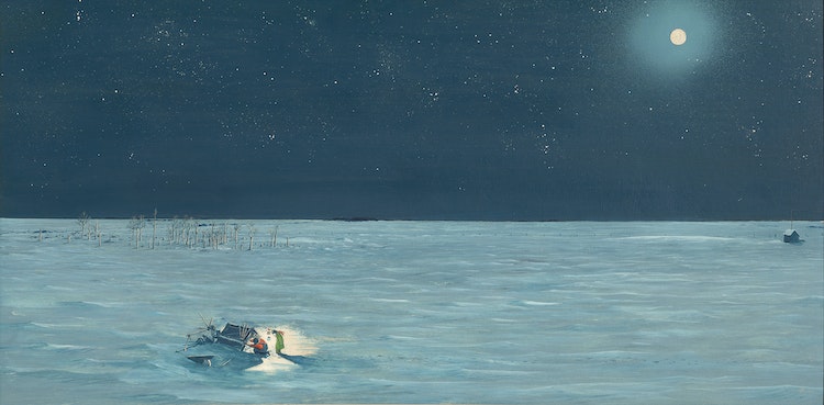
Cornelius Krieghoff moved to Quebec City in 1853, encountering a vibrant and growing city. As Dennis Reid remarked: “Almost as large as Montreal at a population of some 58,000, close to 40 per cent anglophone (as opposed to the then slightly more than 50 percent anglophone component of the Montreal population) it was the military headquarters for British North America, the centre of the all-important timber trade with Britain, the location of the burgeoning new ship building industry and since October 1851, had been the seat of the government for the province of Canada.”
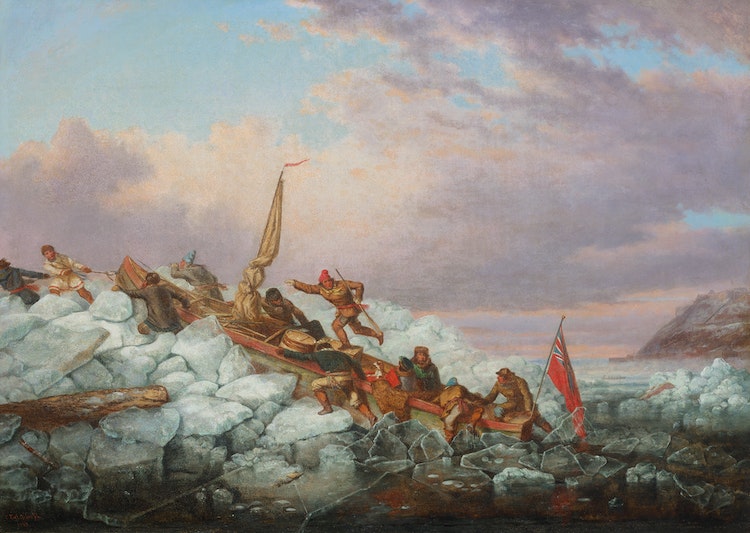
While pioneer life was rugged and precarious, it was also a productive and fruitful time for Krieghoff as he recorded the industry and ingenuity of the people of Quebec City. At this time, there was no bridge over the St. Lawrence River, and so to cross this mighty body of water to access Lévis on the opposite shore, one had to embark upon a perilous journey in a Royal Mail canoe. Marius Barbeau, Krieghoff’s early biographer, points out that, “The cutting of lumber in the woods and the driving of rafts down the Ottawa and the St. Lawrence gave rise to a great Canadian industry in the earlier part of the nineteenth century, and Krieghoff, like his predecessor Bartlett, interprets some of its aspects upon canvas.”
Few would embark upon this journey across the St. Lawrence River in a Royal Mail canoe unless necessary. Passengers had to lay down or seat themselves in the canoe, which was manned by ten or twelve people. The canoe would be paddled through the open water amidst floating islands of ice. This crossing would take hours and was dangerous, with the passengers often reaching a shoreline that was miles beyond the point at which they had started. According to J. Russell Harper, “The boatmen or canotiers who operated these were a hardy breed who jumped out on the ice floes which impeded their progress and hauled the wooden canoes over the obstacles. Some passengers who gave them a hand received a reduction in their passage money. It was an adventurous trip for the uninitiated, and one of the experiences remembered by visitors to Quebec in the winter months.”
Krieghoff has chosen to depict a heightened scene of drama in this composition of a Royal Mail canoe making its crossing at winter. This canoe bears the responsibility of safe passage for eleven people, which includes a woman seated on a bearskin rug holding her dog, secured in the back half of the vessel. The citadel and ramparts of Quebec City are silhouetted in the distance, anchoring the scene. The energy and hard work involved in this venture, as well as the frenzy and cold nature of the excursion vibrates from the canvas. The boatmen are hustling to pull and push the boat over the ice floes before the vessel freezes in place, while one worker blows a horn signalling their position in the river. No one aboard the Royal Mail canoe seems particularly alarmed by what appears to be an experience that could have an uncertain outcome.
Krieghoff specialized in genre paintings, and this work is a remarkable anecdotal image of the human struggle against ice floes and the ferocity of the upper St. Lawrence River in the depths of winter. Barbeau lists six known versions of this subject, painted between
1859 and 1862. “Under his vivid brush they are alive with fun and movement,” stated Barbeau. A similar variant to this 1860 canvas is “Crossing the St. Lawrence with the Royal Mail at Quebec,” an 1859 canvas in the collection of the Sobey Art Foundation. Krieghoff is known to have painted more than one of the same image in various canvas sizes and also recognized the commercial benefit of lithography, a popular endeavour in this period. A lithograph of a Royal Mail canoe making the arduous St. Lawrence River crossing was produced from one of Krieghoff’s versions of the painting, but the citadel of Quebec City was eliminated.
Krieghoff visited Montreal around the time of the erection of the Victoria Bridge between 1854-59 and sold one of his canvases of the Royal Mail canoe crossing to an engineer working on the project. When a book was issued on the development of this ground-breaking new bridge, Construction of the Great Victoria Bridge in Canada, illustrations demonstrating the inadequacy of the boats used to cross the river in Montreal were included, highlighting the convenience of the new bridge. Krieghoff’s painting of the Royal Mail canoe crossing was included. However, this reproduced image removed the Quebec citadel from the horizon line, declaring the depiction to be in Montreal, thus strengthening the case for the triumph of the Victoria Bridge.
Krieghoff was an artist attuned to the interests of his audience and was beloved by collectors during his lifetime. The legacy of “The Royal Mail Crossing the St. Lawrence” as a treasure within his artistic oeuvre is further solidified by the rarity of a canvas with such an abundance of figures, exquisitely rendered detail and narrative strength. Krieghoff produced dignified paintings that were romantic in nature, evoking the deep roots of the people he encountered and imparting his own vision of historical Canada. Reid argues for “the complex genesis of Krieghoff’s images of Canada”, in which this canvas holds a prominent place.
American artist Andy Warhol once declared “I want to be as famous as the Queen of England”. A leading figure of the Pop Art movement of the 1950s and 60s, Warhol was famous for appropriating familiar images from consumer culture and mass media, including many silkscreen prints of public figures. Determined to become a celebrity himself, he made art out of what people desired most: money, power and fame. Some of his early subjects in the 1960s were photographs of Marilyn Monroe, Elvis Presley, and Elizabeth Taylor. By the following decade, he had garnered sufficient success and recognition that he began to receive portrait commissions from living celebrities including the Shah of Iran, Mohammad Reza Pahlavi, as well as his wife and sister, Mick Jagger, Liza Minnelli, John Lennon, Diana Ross, and Brigitte Bardot. People were eager to be immortalized in Warhol’s signature silkscreen techniques and fluorescent colour schemes.
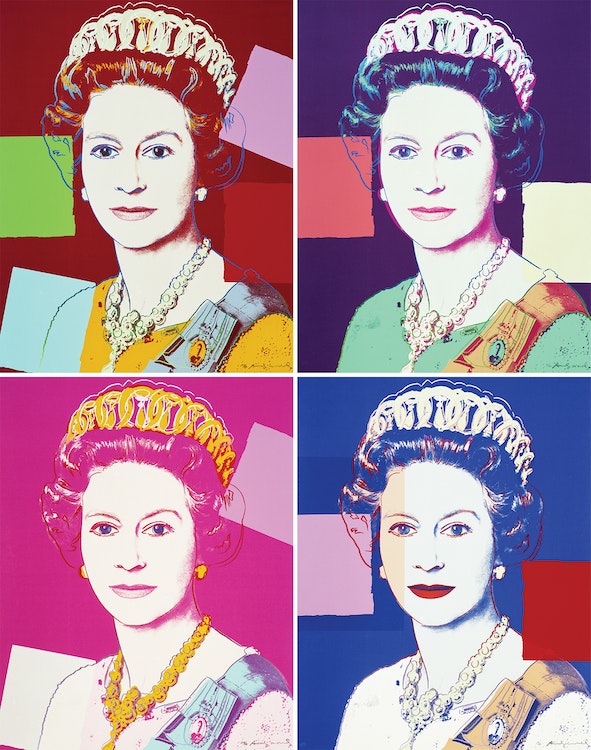
However, there were some public figures who remained out of reach for Warhol. One was Queen Elizabeth II, who was widely considered the most recognizable person in the world. Warhol was eager to make a portrait of her, and in 1982 his European dealer George Mulder wrote a letter to the monarch’s private secretary, Sir William Heseltine. Mulder requested permission for Warhol to create a set of four silkscreen prints using the Queen’s official portrait from the Silver Jubilee in 1977, a photograph taken by Peter Grugeon at Windsor Castle on April 2, 1975. Heseltine replied with an ambiguous, but ultimately favourable response, writing, “While The Queen would certainly not wish to put any obstacles in Mr. Warhol’s way, she would not dream of offering any comment on this idea.”
Delighted, Warhol set to work on his largest and most ambitious portfolio of silkscreens. The result was the Reigning Queens series featuring four prints each of Queen Elizabeth II of the United Kingdom, Queen Beatrix of the Netherlands, Queen Ntombi Twala of Swaziland and Queen Margrethe II of Denmark. These four female monarchs were all ruling in the world at the time of the portfolio’s publication in 1985, and each of them had assumed the throne by birthright, rather than through marriage. Warhol, who was fascinated by universal images, based these silkscreens on the queens’ official state portraits, as these photographs were often mass-produced on currency and stamps. Warhol presents Queen Elizabeth II as an iconic and glamorous figure. “Time Magazine” wrote that Warhol’s portraits of Queen Elizabeth II “treat her like any other celebrity, frozen in time and bright colours”. The repetition of the four prints is reminiscent of postage stamps, referencing the extent of the mass production of the Queen’s image. Warhol has treated the Queen not as a monarch, but as one of the many celebrities he depicted. His approach reinvigorated the traditional presentation of royalty.
The same image of Queen Elizabeth II appears in all four prints but they vary in colour. Each features graphic colour blocks applied separately over the photographs. Warhol began working in this style in the mid-1970s, fragmenting the image with various overlaid shapes and areas of colour. He also added his own outlines, suggesting the stylized make-up of a Hollywood star, and associating the portrait with the cult of celebrity that was prevalent in the 1980s and in Warhol’s œuvre. By comparison to his earlier prints which had a deliberately impersonal, automated appearance, these decorations to the image gave the work a more ‘artistic’ look. With his typical ambivalent attitude, Warhol explained these modifications to his prints as extraneous: “I really would still rather do just a silkscreen of the face without all the rest, but people expect just a little bit more. That’s why I put in all the drawing.”
“Queen Elizabeth II” was well-received by the Royal Collection of the British Royal Family, who wrote that “Warhol has simplified Grugeon’s portrait so that all that remains is a mask-like face. All character has been removed and we are confronted by a symbol of royal power”. George Mulder sent photographs of the prints to the Palace, possibly hoping the Queen might consider purchasing one. Heseltine replied to Mulder: “I am commanded by the Queen to acknowledge your letter of 11th March and to thank you for sending the photographs of the silkscreen prints by Andy Warhol which Her Majesty was most pleased and interested to see”. Later, in 2012, four prints from the Royal edition of “Queen Elizabeth II” were acquired by the British Royal Collection. These prints are the only portraits in the Royal Collection that Queen Elizabeth did not sit for or commission.
The Reigning Queens series combines many of Warhol’s central themes – celebrity, portraiture, consumerism, decoration and social hierarchy.
The four works comprising “Queen Elizabeth II” are printed in an edition of forty with ten artist proofs, five printer proofs and three hors commerce. The work is also published as a Royal Edition with diamond dust on the drawing lines, published in an edition of thirty with five artist proofs, two printer proofs and two hors commerce. These four silkscreen prints are highly coveted, particularly as a complete set, as they had a rejuvenating influence on the nature of portraiture and are some of Andy Warhol’s most celebrated work.
This collection of four works is being sold to benefit the Winnipeg Art Gallery (WAG)-Qaumajuq in establishing an endowment fund to support more diverse representation in the permanent collection, beginning with contemporary Indigenous art. Cowley Abbott is proud to donate our selling commission to the fund as part of the sale.
Joan Mitchell was a prominent American artist closely associated with the Abstract Expressionist movement, the New York School, and international abstract painting of a gestural sort. She spent most of her professional life in France, first in Paris in the 1950s, and from 1967 in Vétheuil, Claude Monet’s home from 1878-1881. While in France she exhibited at the most acclaimed international venues for contemporary art, including 5th Bienal do Museo de Arte Moderna, São Paulo, Brazil (1959), Documenta II in Kassel, Germany (1959), and the 29th Venice Biennale (1958).
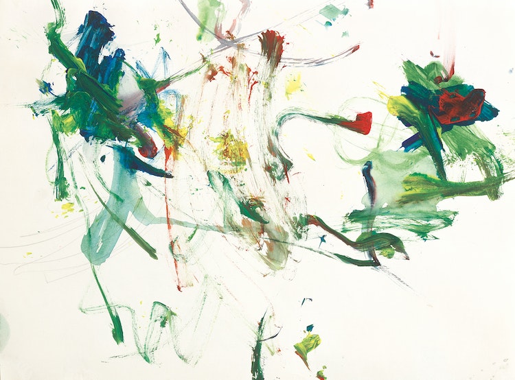
Typical of Mitchell’s art in general, Untitled is both delicate and powerful. She frequently worked on paper, expressing gestures that seem larger in scale than they actually are, in part because the forms animate a fundamentally open space. Areas in the upper left and right of this surface are particularly intense thanks to the accumulation of dark green, red, and blue pigment. If these zones might seem to implode from their own weight, for balance, Mitchell simultaneously thins some of her colours and streaks them across the surface. The light blue and delicate green skeins of pooled colour under the two denser forms to the left and right respectively seem to soak into the surface. Yet Mitchell’s brushstroke is always evident, moving the colour around no matter how ephemeral it becomes. This effect is especially evident in the centre of the work and holds the more heavily worked dancing forms apart.
The comparison of one artist with others in their immediate context or from a longer history is a hallmark of writing about art in museums, auction catalogues, and Art History. Mitchell is often discussed with reference to other women members of the AbEx circle‒Helen Frankenthaler or Lee Krasner, for example‒and especially with respect to her long-time life partner, the Canadian abstract painter Jean Paul Riopelle. Such comparisons can be enlightening, as many witnessed in the 2017-18 exhibition “Mitchell/Riopelle: Nothing in Moderation”, which systematically and extensively placed works by both abstractionists into visual conversation. Nonetheless, comparison invites the establishment of a hierarchy or of a false dichotomy, whether covertly or overtly displayed. It’s worth asking whether we should, in the face of Mitchell’s Untitled, default to comparisons at all.
Is the alternative to perceive this painting on its own terms? Do we see it as highly dynamic, an intimation of a life force and testimony to abstract painting’s abilities, or is it perhaps received as agitated, an embodiment of a delicate rage? The painting does not tell us what to see, think, or feel. It is a testament to what the eminent art historian Linda Nochlin (1931‒2017) ‒Mitchell’s contemporary and friend‒ memorably called the painter’s “poignant visual searching.”
We extend our thanks to Mark A. Cheetham, a freelance writer and curator and a professor of art history at the University of Toronto for contributing the preceding essay. He is author of Abstract Art Against Autonomy: Infection, Resistance, and Cure since the ‘60s (Cambridge University Press).
A founding member of the second group of “Les Plasticiens” in Montréal in 1955 and constantly innovative throughout his long career as a painter, poet, and university teacher, Guido Molinari was a prominent spokesperson for abstract art from the 1950s until the 2000s. There is no abstract painter in Canada who delved deeper into the profundities of the genre than Guido Molinari, which suggests why “Bi-sériel rose” is as vibrant and immediate now as when it was painted in the late 60s.
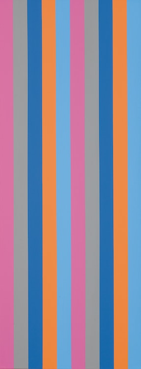
Molinari’s rigorously organized canvases require our close, even literal, attention. Both geometrically regular and chromatically complex, they work optically, corporeally, and intellectually. “Bi-sériel” rose clearly announces its key colour and organizing principle. We see two series of five colour bands; from left to right, rose, grey, darker blue, orange, and lighter blue. Because his individual colours work together (the orange and darker blue as complementary colours, for example), however, in addition to isolated stripes, they stand out as blocks in what remains a repeated sequence with variations. Individual colour columns repeat, but so do pairs of colours. The painting does not allow us to rest optically, nor does it have a stable centre (impossible with ten colour bars, unless one pairs two in the middle, as Molinari does here, leaving four symmetrical flanking columns on the left and right). Instead, our eyes and our bodies (because the painting is vertical and at a human viewer’s scale) are moved by the colour bands. We take part in a chromatic and intellectual game whose conventions are established by the painting. The game is complex but not infinite: the sequence is also clearly bounded by the fame, guaranteeing that the left edge (rose) differs from that at the right (light blue).
While “Bi-sériel rose” is primarily a painting to be taken on its own optical terms, Molinari‒akin to many abstract artists‒responded to the ambient world and encouraged his canvases to reverberate well beyond the frame. The sériels from this period, for example, were inspired by and closely cognate with his interests in the modern classical music of Schönberg and Webern.
We extend our thanks to Mark A. Cheetham, a freelance writer and curator and a professor of art history at the University of Toronto for contributing the preceding essay. He is author of “Abstract Art Against Autonomy: Infection, Resistance, and Cure since the ‘60s” (Cambridge University Press).
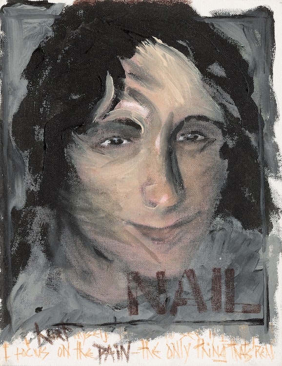
According to the David Bowie expert Andy Peters: “This artwork is another ‘DHead’ of Trent Reznor and includes part of the lyrics written in David’s hand at the foot to NINs big hit ‘Hurt’ which is a unique selling point. This painting never existed in his original inventory of 66 official DHead paintings most of which were made commercially available and was instead part of the rumoured extra 40+ ‘nonpublished’ DHeads he had also created in the period between 1994 and 1997.”
In 1995 Nine Inch Nails opened for David Bowie on his Outside Tour, where he sang ‘Hurt’ with Trent Reznor. During their time spent on tour together in the 1990s, a close friendship was born that lasted until Bowie’s death in 2016. Most famously, they collaborated on ‘I’m Afraid of Americans’, a single from Bowie’s album Earthling.
We would like to thank Andy Peters at davidbowieautograph.com for his assistance with researching this artwork.
Lawren Harris and A.Y. Jackson first painted on Lake Superior in October 1921. They took the Algoma Central Railway from Sand Lake, Algoma north to Franz, where they caught the Canadian Pacific train travelling west to Rossport and Schreiber. Harris would return to paint and draw on the north shore of Lake Superior almost every October until 1928. His Lake Superior canvases range from depictions of the rocks, hills and bays and interior lakes to dramatic visions of the light over the vast body of water.

To better express his expanding vision of the landscape, in 1925 Harris began to paint on beaverboard panels that were approximately 12 x 15 inches (30.5 x 37.6 cm) rather than his earlier supports that measured approximately 10 1⁄2 x 13 1⁄2 inches (26.3 x 34.4 cm).
Harris frequently reinterpreted similar subjects, exploring in each work variant compositions in new pictorial languages. In May 1926 he presented a painting titled “Northern Lake” in the Group of Seven exhibition at the Art Gallery of Toronto. “Northern Lake” was worked up from a 12 x 15 inch oil sketch of 1925 now in the McMichael Canadian Art Collection (accession 1969.17.1). “Northern Lake” was one of the five Harris paintings included in the Canadian section of the Sesqui-Centennial exhibition in Philadelphia in the summer of 1926 (no. 1564, reproduced in the Philadelphia catalogue) where it was awarded a gold medal.
Jeremy Adamson, organizer of the major Harris retrospective at the Art Gallery of Ontario in 1978, has argued that the medal was awarded to Harris’ canvas “Ontario Hill Town” (University College, Toronto), not “Northern Lake”, though two reviews of the Annual Exhibition of Canadian Art at the National Gallery in Ottawa in January 1927, where “Northern Lake” was subsequently exhibited hors catalogue, confirm that “Northern Lake” was indeed the gold prize winner.
“Quiet Lake” is a similar composition to “Northern Lake” though clearly an evolution from the earlier canvas. The title “Quiet Lake”, a very a‒ characteristic title, was given to this painting when it was catalogued by Doris Mills, a friend of Harris’ wife Bess, in 1936. Mills listed it among a group of canvases she identified as Northern Paintings, of which this was number 12, not among Harris’ Lake Superior paintings.
However, the site is identified in a related sketch titled by the artist “Above Coldwell Bay, North Shore, Lake Superior” (sold Sotheby Parke Bernet (Canada), Toronto, 5 November 1979, lot 156). The lake depicted here was first painted by Harris prior to 1925, as there is an oil sketch of this same lake on a smaller panel (sold Sotheby’s Canada, Toronto, 3 December 1997, lot 155). However “Quiet Lake” was worked up from a panel of 1925 measuring 12 x 15 inches and titled by the artist “Northern Lake, Ontario, October”.
In both “Quiet Lake” and “Northern Lake” the point of view is determined by the foreground ‘ledge’. The lake opens up in the middle distance and is framed by the curves of the surrounding hills. In “Northern Lake” the hills rise left and right with the cold blue light of the sky glowing in the centre distance, reflecting on the water and casting shadows on the still lake. As Bertram Brooker wrote, the painting is “sombre, but none the less restful. In that sketch the distant rise upper left is painted in contrasting striations as on the hill upper right, whereas in the canvas “Quiet Lake” the yellow covers the entire slope.
There are similarities and differences between “Northern Lake” and “Quiet Lake”. In “Quiet Lake” Harris heightened the tonal contrasts, painting the autumn grasses and foliage in a bright, mustard palette. The silhouettes of the reflections in the quiet lake create an abstract pattern, as solid as the foreground rock, and are surrounded by the pale green trees lower right and dark green trees centre left. In contrast to “Northern Lake”, the hills are less symmetrical and the interplay of the dominant forms creates a less restful and more dynamic image. The eye follows the dominant yellow from lower right to upper left while the left shore juts into the open centre linking to the dark hill upper right.
To date it has been impossible to identify “Quiet Lake” with any canvas Harris exhibited in the 1920s. It clearly developed out of and postdates “Northern Lake” of 1926.
We extend our thanks to Charles Hill, Canadian art historian, former Curator of Canadian Art at the National Gallery of Canada and author of “The Group of Seven‒Art for a Nation”, for his assistance in researching this artwork and for contributing the preceding essay.
Included in exhibitions for over a century and once part of the collection of the artist’s family for over fifty years, Tom Thomson’s Ragged Oaks makes its auction debut with Cowley Abbott this spring season. Canadian art historian and Tom Thomson scholar, Joan Murray, notes that 1916’s Ragged Oaks is a magical and vigorous quintessential Thomson painting in which balance is the key to beauty, from the oaks off-centre to the foliage and bush, to the colours used throughout.
In the Cowley Abbott spring catalogue, Murray describes the power of the composition where the two oak tree trunks are depicted in a location of spectacular beauty. The leaves tumbled on the ground and the brilliant orange foliage and bush to one side balanced by bright leaves on the other reveal a scene of sparkling vitality, with all the liveliness Thomson wished to record and which appear in his best works. From the background tapestry of distant trees to the scattered logs of the foreground, the painting practically hums with energy, but the energy is matched with the harmony of Thomson’s excited palette.
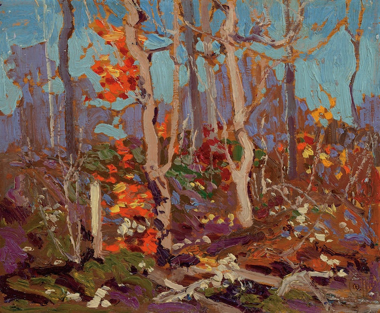
Murray describes Ragged Oaks as one of Thomson’s best sketches of 1916, the artist’s “golden year”, where he recorded varied configurations of the trees he countered; from Ragged Oaks through to those we see in the sketches for two of Thomson’s most well-known works, The Jack Pine and The West Wind.
The year is inscribed on the reverse of the panel, as well as, “Not For Sale”. Not surprising, given the quality and vivaciousness of Ragged Oaks. The painting was once owned by Fraser Thomson, Tom’s youngest brother. Fraser described the composition to a biographer in 1930: “A Cobalt blue sky with two ragged oak trees a little off centre with two patches of foliage in glowing color with foreground in green Brown purple manner with Blue + yellow, a real painting”.
The private collectors acquired the artwork from the Fraser Thomson’s family in 1971 and it was a treasured gem within their museum-quality collection. Ragged Oaks is featured in Cowley Abbott’s Auction of Artwork from an Important Private Collection on June 8th.
Rob Cowley Chats with Mona Mahmoud at CTV Morning Live Vancouver about the Upcoming Spring Auction Season at Cowley Abbott. They discuss the ten commandments of valuing artwork, along with artworks by Emily Carr, Lawren Harris, Tom Thomson and Andy Warhol, each being offered in the Cowley Abbott Spring Live Auction on June 8th, 2023.
William Kurelek was a skilled storyteller, whose work provides his insight related to a wide variety of personal subjects which often focused upon his life, heritage, and religion. Kurelek’s most celebrated compositions continue to be those which reflect his upbringing and memories of life on the farm. The painter’s work explored both the tender and the gruelling aspects of daily life on the Prairies, the scenes populating the 1964 Isaacs Gallery exhibition An Immigrant Farms in Canada, the first of several such shows which Kurelek would present.
This painting, A Bolt Like That, painted in 1965, was not featured in these exhibitions, however it does appear in William Pettigrew’s 1967 National Film Board documentary, Kurelek. The captivating beauty of Kurelek’s expansive prairie landscape led the owner to purchase the painting from Toronto’s Isaacs Gallery soon after it was painted, A Bolt Like That remaining in their collection for close to sixty years, soon to make its auction debut with Cowley Abbott during the June 8th Live Auction of Important Canadian & International Artwork.