

Basse messe, dimanche by Quebec Master, Lemieux is among historical and post-war auction highlights from Consignor Canadian Fine Art, now Cowley Abbott
October 23, 2019 (Toronto, ON) – An exceptional opportunity to own a major canvas by one of Canada’s most celebrated painters is up for auction from Cowley Abbott (formerly Consignor Canadian Fine Art) as part of its semi-annual Fall Live Auction of Important Canadian Art, taking place Tuesday, November 19 at Toronto’s Gardiner Museum. Presenting key work by Canada’s preeminent historical and post-war artists, many of which will be going under the hammer for the first time, the newly minted Cowley Abbott will also be celebrating the rebrand of the auction house under the monikers of its principals, Canadian auction industry veterans Rob Cowley and Lydia Abbott.
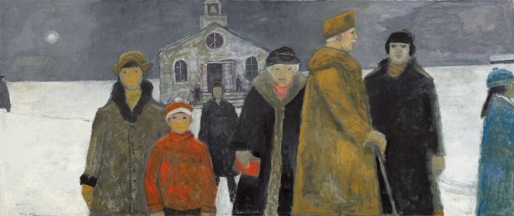
Jean Paul Lemieux’s Basse messe, dimanche (Low Mass, Sunday), painted in the classic style for which the artist is most celebrated, will make its auction debut with an estimate of $300,000 – $500,000. Basse messe, dimanche is a stunning canvas that depicts a group of parishioners exiting a church in the early morning, exposed to the winter cold under the harsh light of a white moon. Measuring nearly eight feet wide, the painting is one of the largest of the period by a key figure in Canadian modernity. Imbued with themes of Nordic sensibility and melancholy, Lemieux drew inspiration from memories of a bygone era in which Quebec traditions, customs, and popular religious beliefs gave life and structure to the artist’s community.
“It is our privilege to introduce Basse messe, dimanche to the public for the first time at auction,” said Rob Cowley, President, Cowley Abbott. “This commanding, stunning canvas provides Jean Paul Lemieux’s classic view of Quebec and Canadian culture, effectively capturing themes of community, faith and isolation across an expansive winter landscape. The rich colour and larger-than-life characters that occupy the spectacular composition have stopped collectors in their tracks during early previews of this important painting by one of our country’s most renowned painters.”
The fall auction also provides a chance to own a piece of Canadian history, with a rare work on offer by Canadian scientist, physician, painter and Nobel Prize recipient Sir Frederick Banting. European Landscape (1925) was painted during his trip to Europe where he accepted the prestigious Nobel Prize in Physiology or Medicine for his involvement in the discovery of insulin; and the work provides a rare glimpse from Banting at the point of receiving the highest honour in his field. As the then youngest laureate and first Canadian to receive the prestigious prize, Banting was also named Time Magazine’s “Man of the Year” on the cover of its August 1923 issue, making him a renowned figure of scientific progress around the world. The painting has a distinguished provenance that includes being privately owned by members of the Banting family, and is accompanied by a letter from Banting’s son detailing the piece’s history and the trip during which the painting was created. European Landscape has a pre-auction estimate of $20,000 – $30,000, which Cowley Abbott anticipates could exceed expectations.
Multiple key works by William Kurelek will be featured in Cowley Abbott’s fall live auction including Pioneer Homestead on a Winter’s Evening (1971). Housed in a custom frame made by Kurelek, the painting depicts a Ukrainian woman drawing water from a well on the Canadian prairie in winter, and is an exemplary showcase of the artist’s characteristic themes and subject matter related to immigration, farming on the Prairies, Ukrainian heritage, and the harsh beauty of the Western Canadian landscape. The painting comes from the private collection of a Ukrainian-Canadian family in Toronto with an auction estimate of $50,000 – $70,000.
From the same collection comes Brothers, a larger winter farming painting by William Kurelek that has an auction estimate of $100,000 – $150,000. Commissioned by the family following their purchase of Pioneer Homestead on a Winter’s Evening, the composition presents two brothers walking together on a vast Prairie landscape, distantly following their father upon a horse-drawn sleigh.
“Our Fall Auction of Important Canadian Art features striking and rare examples by our country’s illustrious painters, sculptors and print-makers. Entrusted to our firm from Canadian and International private and corporate collections, it is a pleasure for our team to present these fantastic works to the collecting public, in many cases for the first time.” – Lydia Abbott, Vice-President, Cowley Abbott
Other notable artworks featured in Cowley Abbott’s Fall Live Auction include:
- A 1936 painting by Emily Carr depicting the Strait of Juan de Fuca, is a richly coloured work alive with the movement of the ruggedly beautiful British Columbia landscape. The painting comes from a United States private collection, available at auction for the first time with an estimate of $125,000 – $175,000
- Two rare canvasses by 19th century master Cornelius Krieghoff, bothfrom a private collection: Indian Encampment by a River Autumn (1849) is being offered with a pre-sale estimate of $60,000 -$80,000 and Hudson Bay Trader (1845-47) at $40,000 – $60,000
- La Mare, Baie St. Paul, a 1920 oil on panel by Quebec painter Clarence Gagnon. This panel, a sketch for The Pond in October housed in the National Gallery of Canada’s permanent collection, is being offered with an estimate of $15,000 – $20,000
- A trailblazer for women in the arts in Canada, Molly Lamb Bobak’s Highland Games, Fredericton is expected to excite collectors with its colourful and heavily populated setting during the city’s Highland Games Festival. This large 40” x 48” canvas is likely to exceed its pre-sale estimate of $30,000 – $50,000
- One of Canada’s earliest and most renowned champions of abstraction, Bertram Brooker’s Autumn Bouquet makes its first appearance at auction, subject to a $20,000-30,000 estimate. Cowley Abbott set an auction record for a work by Brooker in the fall of 2018, Delta Ice House more than tripling its opening bid to fetch $82,600
Historical offerings in the auction also include the workof the Group of Seven, Sybil Andrews, J.W. Beatty, André Biéler, J.W. Morrice, P.C. Sheppard, M.A. Suzor-Coté, Robert Pilot and Frederick Verner.
Post-War Contemporary and Abstraction artists are also strongly represented in the sale with works by David Blackwood, Jack Bush, Greg Curnoe, Sorel Etrog, Paterson Ewen, Joe Fafard, Betty Goodwin, Ted Harrison, Gershon Iskowitz, Maud Lewis, John Little, Jean McEwen, Norval Morrisseau, Kazuo Nakamura, William Perehudoff, Bill Reid, Goodridge Roberts, Otto Rogers, Gordon Smith and Takao Tanabe.
Live previews will take place at the Cowley Abbott Gallery located at 326 Dundas Street West (located across the street from the Art Gallery of Ontario) beginning the weekend of Art Toronto – Friday, October 25. Cowley Abbott’s Fall Live Auction of Important Canadian Art will take place on Tuesday, November 19 at 7 p.m. EST at the Gardiner Museum located at 111 Queen’s Park, Toronto, ON.
Since its inception in 2013, Cowley Abbott’s live and online auctions have included headline-grabbing works such as a rare 100-year-old Tom Thomson portrait (Daydreaming, sold for $172,500), a celebrated depiction of Kensington Market by William Kurelek (Hot Day in Kensingon Market, sold for $472,000), and Jack Bush’s Summer Lake, which broke online auction records in May 2014 for the most expensive painting by a Canadian artist to be sold in an online auction ($310,500). Their inaugural live auction event in May 2016 set the record for the highest-selling Algoma sketch by Lawren Harris, fetching $977,500, tripling the previous auction record.
Cowley Abbott is currently accepting consignments for its upcoming auctions. Cowley Abbott offers all-inclusive selling commissions and the lowest buyer’s premium in the industry. Those interested in consignment can arrange a complimentary and confidential consultation by contacting Cowley Abbott’s specialists at 1-866-931-8415 or mail@cowleyabbott.ca.