

Rob Cowley Speaks with BNN Bloomberg about the Art Market & the Spring 2026 Auction Season
-
Gordon Smith – Spring Live Auction: Select Masterworks of Canadian & International Art (May 27th)
Senior Specialist Rob Cowley discusses Winter Forest M by Gordon Smith
Gordon Appelbe Smith has been a significant figure in Canadian art from the 1950s to the present. Smith’s diverse and inventive oeuvre encompasses printmaking, sculpture, assemblage and photography, though the artist’s commitment to painting was paramount. Born in England in 1919, Smith settled in Canada in 1933. In 1951, Smith studied with Elmer Bischoff at the California School of Fine Arts. This proved to be a pivotal, formative experience. Bischoff helped to introduce Smith to action painting, encouraging him to work spontaneously with large, unwieldy brushes and house paint on large sheets of canvas laid out on the floor. Prolific and experimental, Smith’s painting career was marked by a series of creative breakthroughs that manifested as distinct shifts in his visual style over the course of his artistic career.

While exploring various modes of abstraction, Smith also returned repeatedly to the influence of the West Coast. Smith’s love of the land remained consistent throughout his life, and the artist continually incorporated this vital subject into his work. The artist’s experiences of time spent in the vast forests of British Columbia provided rich inspiration. Art historian Andrew Hunter noted that in the early 1980s, Smith “travelled throughout British Columbia and into the dense forest landscapes of the province… Smith found his new bridge, and he made a breakthrough. Like Emily Carr before him, Smith wandered out into the wilderness and found his voice… Smith was renewed: the vigour and intensity of his painting, the inquisitiveness that marked his first probings into abstraction in the 1950s, returned.”
Through the act of painting, Smith transformed the forest into an imaginative and ambiguous space, which he used as an armature for his painterly concerns. Winter Forest M depicts a closely cropped, snowy thicket. Light pours down in a column from the top centre, creating a visual opening in the undergrowth. The painting offers startingly different experiences when viewed from a distance or in close proximity. From several steps back, the image appears solidly realist and meticulously rendered. Up close, the loose, energetic brushstrokes of Winter Forest M become wonderfully vital and chaotic. The full range of colours in the work is also revealed. On the subject of Smith’s forest paintings, Hunter wrote: “I imagine Smith in the space of the painting, watching him move, thrusting and drawing back, stumbling and wiping, and try to imagine the associations—the pressing weight of moist cedar bows, wet snow heavy on the foliage, the tension on the arching branches as the pure white mass holds them down, forming a canopy over the decaying undergrowth.”
-
Edward John (E.J.) Hughes – Spring Live Auction: Select Masterworks of Canadian & International Art (May 27, 2026)
Senior Specialist Anna Holmes discusses Sooke Harbour Landscape by E.J. Hughes
Sooke Harbour Landscape of 1951 is an exciting discovery among the paintings of Edward John Hughes. Created in his early period immediately after his discovery by Dr. Max Stern of the Dominion Gallery, it was soon sold and has remained essentially unknown in a corporate collection ever since.

Edward John Hughes Sooke Harbour Landscape
The painting comes from an integral period in Hughes’ life. As soon as Hughes was demobilized after his work as a war artist, he was granted the Emily Carr Trust, a scholarship for British Columbia artists, and was awarded $1,200.
In the spring of 1947 Hughes used some of that money to travel up the B.C. coast to Prince Rupert on the CPR ship, Princess Adelaide. The trip resulted in some useful sketches, but Hughes found that travelling on ship was not satisfactory for his purposes. The ship rarely stopped long enough for him to sketch, and he found the presence of the other passengers intrusive.
In May of 1948, Hughes and his wife Fern, moved to a small house in the Fernwood area of Victoria. As soon as they were settled, the artist took off for a two-week expedition to Sooke, a small community 35 kilometres west of Victoria along the Strait of Juan de Fuca. Every day a Vancouver Island Coach Lines bus made a round trip to Jordan River, beyond Sooke along the southern coast of the island. It was a gravel road at the time and provided access for the logging operations and other construction projects which were active in the region.
This trip was to be a test for Hughes, to see how he would get along travelling by bus and setting up for a week or two in a single location. This was the only time Hughes sketched at Sooke.
Hughes was in the Sooke Harbour area for about two weeks, staying at the Sunny Shores Auto Court at Saseenos. Five tiny cabins dating from 1942 when the campground was established are still standing at the water’s edge. Since the artist had no car, he walked from there to all his sketching sites. From Sunny Shores, Hughes could hike along the rail line which curved around the Sooke Basin, and a range of prospects opened to him from positions above the shoreline.

Sunny Shores Auto Court, Saseenos, B.C., 2015
At least thirteen pencil sketches resulted from his time here, from which he painted oils and watercolours for years to come. Hughes also created three small oils on wooden panels on location.
Like Sooke Harbour Landscape, the majority of Hughes’ sketches and paintings made during his two weeks in Sooke focus on Coopers Cove, a quiet basin close at hand to Sunny Shores. It was named by members of the Royal Navy survey which sailed the waters in 1846.

A graphite drawing of Sooke Harbour Landscape, 1948.
The painting shows a log boom on the left. What appears to be a few fallen logs on the shore were the Phillips log dump. Above the shore on the left is the railway line and on the hillside above is a slash pile of leftovers from the logging operation. Rising in the distance are the hills of Mount Quimper.
Unlike the Group of Seven, Hughes did not romanticize the unpeopled wilderness, nor did he celebrate the industrial might of Canada’s development. He simply looked at what was in front of him and did his best to assemble the forms and colours into a work of art. The rhythmic disposition of the shapes and the beautiful harmonies of tone and colour have come together in Sooke Harbour Landscape to create a deeply satisfying painting of the west coast shoreline.

A map of the coastline showing the location of Sooke Harbour.
After his two-week stay at Sooke, Hughes looked forward to his summer of sketching with confidence. In June, he made day trips to Sidney north of Victoria and then planned a major adventure travelling up the east coast of Vancouver Island as far north as Courtenay. The drawings which he made on that trip were the foundation of his future career.
Cowley Abbott is pleased to have been entrusted with this painting by E.J. Hughes and we look forward to presenting the artwork in our previews in Calgary, Montreal and Toronto, ahead of the May 27th Spring Live Auction.
-
Emily Carr – Spring Live Auction: Select Masterworks of Canadian & International Art (May 27, 2026)
Senior Specialist Anna Holmes discusses Wind and Grey Trees by Emily Carr
We are delighted to be offering two Emily Carr paintings this spring auction season in Select Masterworks of Canadian and International Art. Each painting has been entrusted to Cowley Abbott from different private collections, both rich in Canadian art historical works that have been acquired over decades. We are privileged to have achieved excellent results with artworks by Emily Carr, witnessing fantastic success at auction.

Emily Carr Grey Trees
Grey Trees is a striking monochromatic work by Emily Carr. This artwork exemplifies the artist’s ability to distill the British Columbia forest into an orchestration of form, rhythm, and tone.
In the early 1930s, Carr made a significant change in her sketching method by adopting the new medium of oil on paper. She sought to combine the spontaneity of watercolour sketching with the intensity of oil pigments, and she found this to be possible by diluting oil paint with generous amounts of turpentine and applying the mixture to Manila paper.
She was able to attain the structure of oil paint with this medium as well as the delicacy of watercolour. It also dried immediately, was easy to layer pigments, and retained its colour intensity – all providing additional convenience.
Works such as this reflect Carr’s interest in Japanese woodblock prints and Chinese ink paintings. She admired the precision of line, the emphasis on brushwork, and the use of negative space in these works, all qualities central to her later ink and wash drawings.
Rendered in a restrained palette of greys, blacks, and whites, the composition of Grey Trees is enlivened by areas of exposed Manila paper, which function as a luminous fourth tone within the surface. The result is an atmospheric interpretation of the forest—less a specific place than an evocation of its enduring presence and inner life.

Emily Carr Wind, 1936
In June and September of 1935 Emily Carr painted at Albert Head, about eighteen miles west of Victoria. Ensconced in her van, the sketching was very productive. Movement was becoming a prime concern for Carr.
“Sketching in the big woods is wonderful,” she wrote. “You go, find a space wide enough to sit in and clear enough so that the undergrowth is not drowning you…Everything is green. Everything is waiting and still. Slowly things begin to move, to slip into their places. Groups and masses and lines tie themselves together. … Air moves between each leaf. Sunlight plays and dances. Nothing is still now. Life is sweeping through the spaces. Everything is alive.”
If Carr increasingly saw her oil on paper sketches as paintings in themselves, they were also the kernels for reinterpretation in future canvases. During the winter, Carr worked at her sketches, and some were shown at the Women’s Art Association in Toronto.
It was from this exhibition that the Toronto collector Charles Band purchased Carr’s British Columbia Landscape, now in the collection of the National Gallery of Canada. Band requested that Carr send some paintings east for his consideration, so Carr sent a selection. However, on January 10th of 1937, Carr suffered a heart attack.
The British art critic Eric Newton was in Vancouver lecturing for the National Gallery and the Gallery’s Director, Eric Brown, knowing that Carr was financially strapped, asked Newton to visit the artist to select paintings for possible purchase.
Among the works Newton selected was this painting, which Carr subsequently titled Wind. She signed it in the hospital before it was shipped to Ottawa.
Wind was not bought by the National Gallery, but it was sent with the other unpurchased paintings to Toronto at the request of Charles Band. These and the other paintings Carr had previously sent to Toronto were included in a solo exhibition at the Art Gallery of Toronto in 1937. The exhibition resulted in a flurry of purchases by Band, J.S. McLean, Eleanor Lyle and the Toronto gallery.
Carr was frequently frustrated by the failure to keep her informed about the whereabouts of paintings she had sent east. The unsold paintings shipped to the Women’s Art Association, to Charles Band and to the National Gallery for exhibitions and purchase consideration, were now handed over to the Picture Loan Society, an artist’s cooperative managed by Douglas Duncan.
An exhibition of Carr’s paintings was held at the Picture Loan Society and among the works shown was Wind, which was kept by the Society for rental or possible sale by instalment. Wind was then returned to Carr after some antagonistic correspondence back and forth.
Wind remained unsold when Carr died in March 1945. In June 1945, Carr’s co-executors, Lawren Harris and Ira Dilworth, agreed to consign all remaining paintings to the Dominion Gallery in Montreal. No. 90 in the list of consigned paintings was Wind, which was sold to Richard Van Valkenburg of the Fine Arts Gallery at the College Street store of the T. Eaton Company in Toronto. Wind was exhibited there in November. The painting then returned to the Dominion Gallery and was purchased by a private collector who built an impressive collection of Canadian art. Having remained in private hands until now, Cowley Abbott is pleased to present this masterwork in Toronto on May 27th.
-
The Canadian Club Collection (Beam Canada)
Spring Live Auction: Select Masterworks of Canadian & International Art (May 27, 2026)
Lydia Abbott highlights this rare collection of artworks from The Canadian Club Collection
Cowley Abbott is privileged to be entrusted with the collection of ten historical Canadian artworks from Beam Canada Inc., formerly in the collection of The Canadian Club Brand Centre, a building with a rich history in the development of Windsor and Canadian Club whisky.

The Canadian Club Brand Centre in Windsor, Ontario
American farmer and entrepreneur Hiram Walker began making his own whisky and selling it out of the back of a grocery store in Detroit in the 1850s. He noticed that it was being purchased and blended with other products and then sold at a higher profit. Wanting more control in the quality and production of his product, Walker purchased 468 acres of land across the river in what is now known as Walkerville, Ontario—a town that laid the foundation for the modern city of Windsor. He built a distillery, and in 1858, Walker officially established Canadian Club Whisky. It took nearly eight years to perfect the recipe that remains unchanged to this day.

A portrait of Hiram Walker inside The Canadian Club Brand Centre in Windsor, Ontario
Walker’s business ventures included many industries that supported the distillery—a ferry and rail lines, barrel-making and grain farming. He also built schools, supplied fire and police services, and had homes built for his employees. Walker created the town, controlled every aspect of it and introduced amenities Windsor did not have, such as running water and streetlights. A bronze statue of Hiram Walker was unveiled in Walkerville in 2022 to commemorate his immeasurable influence on the city of Windsor.

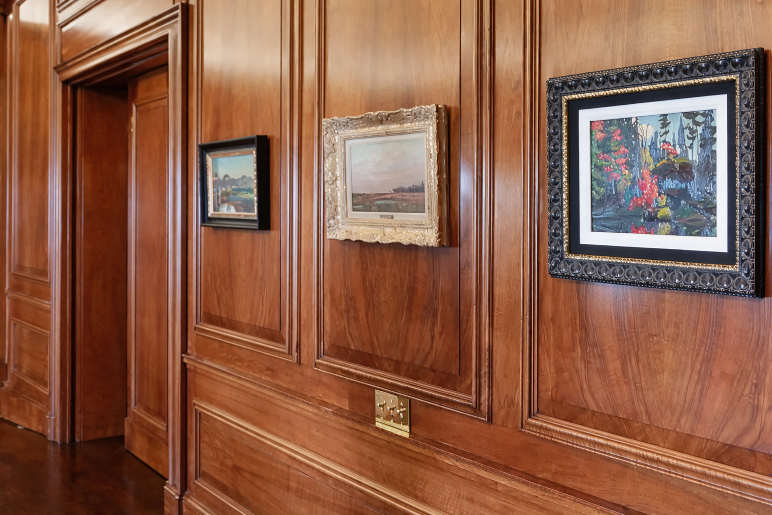
The art room in the Canadian Club Brand Centre in Windsor, Ontario
The Canadian Club Brand Centre in Walkerville opened in 1894 as Hiram Walker’s office and the headquarters of Canadian Club Whisky. The imposing red brick and terra cotta building is considered one of North America’s finest examples of Italian Renaissance architecture. It was modelled after the Palazzo Pandolfini in Florence, a design that inspired Hiram while on a trip to Italy. The inside is fitted with marble fireplaces, elaborate woodwork and ornate brass fixtures, and includes an indoor swimming pool, a basement speakeasy, and a wood-panelled boardroom showcasing paintings by the Group of Seven.
Tom Thomson’s Marsh, Lake Scugog and Lawren Harris’s Maple Bushes both displayed prominently in the art room of The Canadian Club Brand Centre
Featured prominently in the art room was Marsh, Lake Scugog, a 1911 oil painting by Tom Thomson depicting a favourite fishing destination on the outskirts of Toronto. The room displayed one painting by each of the original Group of Seven members depicting classic scenes of Canada’s varied landscape. Evening Light, The Kootenays by Frederick H. Varley and Waterton Lake, Alberta by A.Y. Jackson reflect western Canada. Manitoba is represented by Frank Hans Johnston’s impressionist oil sketch Rocky Shore, Lake of the Woods. Depictions of the Ontario wilderness include Maple Bushes, one of Lawren Harris’s favoured subjects, as well as Franklin Carmichael’s Still Morning, painted in La Cloche, and Arthur Lismer’s Shoreline, Georgian Bay. Atlantic Canada is evoked through the colourful sailboats in Petite Rivière, N.S. by J.E.H. MacDonald.

Tom Thomson Marsh, Lake Scugog, circa 1911
A unique artwork in the Canadian Club collection is a commissioned painting by Canadian artist Henry Sandham, Golf—Canadian Club (The Club’s The Thing), completed in 1898, just one year before Hiram Walker’s death. In the festive summer party scene, we see a Canadian Club labelled wooden crate stowed beneath the serving table. A 1916 oil painting by American artist Philip Russell Goodwin, Camping—Canadian Club, was also commissioned for the Canadian Club offices. The idyllic sunset of two canoeing men arriving at shore features the iconic Canadian Club wooden crate on the rocky edge.

Philip Russell Goodwin Camping-Canadian Club, 1916
The Canadian Club Brand Centre formerly offered tours of the building, teaching visitors about the Walkers, the origins of the Canadian Club brand and the history of the building, including its art collection. A whisky tasting often concluded the tour. Cowley Abbott is honoured to be offering this art collection linked to a significant part of Windsor’s and Canada’s history.

Lawren Harris Maple Bushes, circa 1920
Please click here for additional information on the Collection of Beam Canada (Canadian Club).